Major Project

Land Values


4 Comments

Assessment Contents

This is just a post to reference my assessment submission for both the Body of Work and Contextual Studies, which has surprisingly taken me a whole month to pull together to the standard I wish.

Most of it has been posted hard copy, with reference to this blog, and tutor reports uploaded to the Assessment GDrive.  I’ve also sent a separate electronic copy of the major essay as instructed so I believe that is that for these two modules.

Here is a copy of my contents list for the BoW Assessment submission:

Contents List for Assessment Submission:

Assignment Submissions:

  • Booklet containing abridged details of each assignment submission, including ‘Land Values – An Introduction and Evaluation’ within Assignment 5.

Tutor Reports:

  • Booklet containing a copy of each Tutor Report.

Course Blog:

Body of Work:

  • Book dummy containing the full Body of Work.
  • Selection of A3 size prints of images contained within the book dummy.

Other:

  • Note book used throughout the course (not necessarily of any value other than to myself).
  • Note to Assessors – see below.


Note to Assessors:

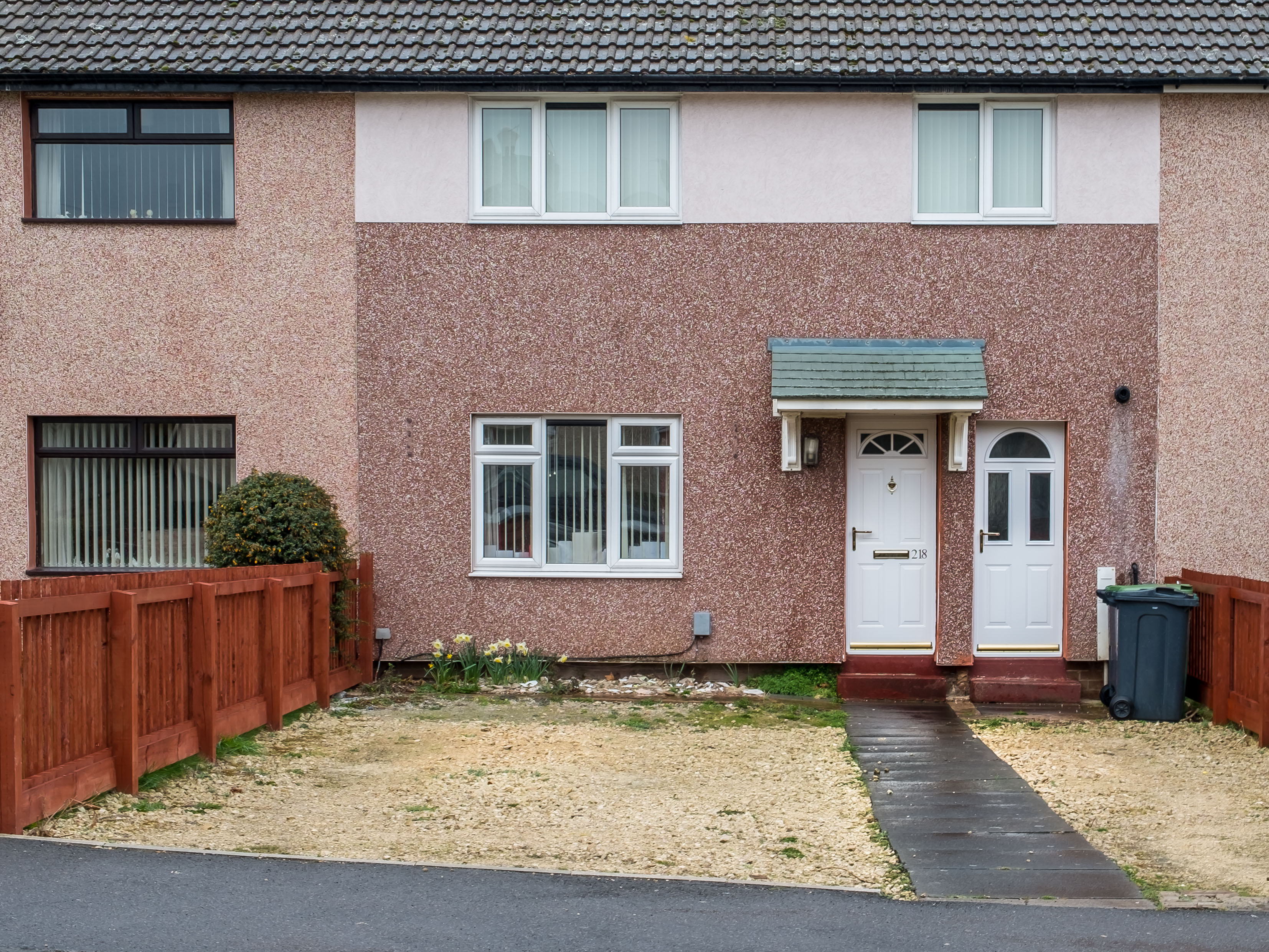
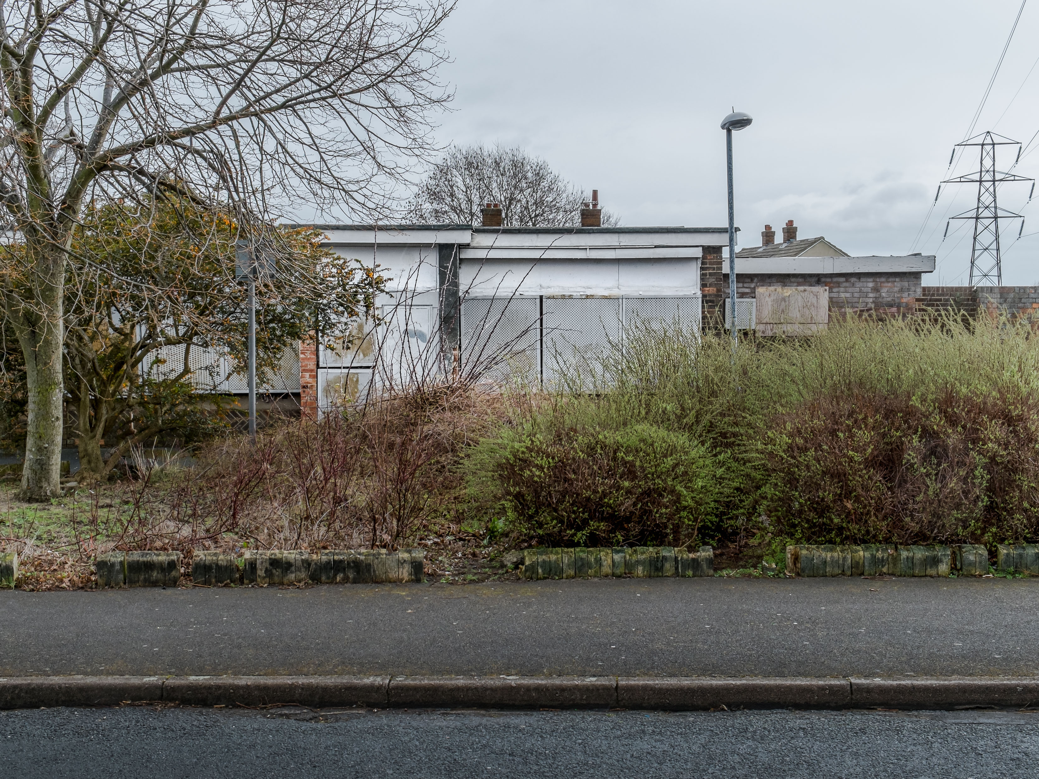
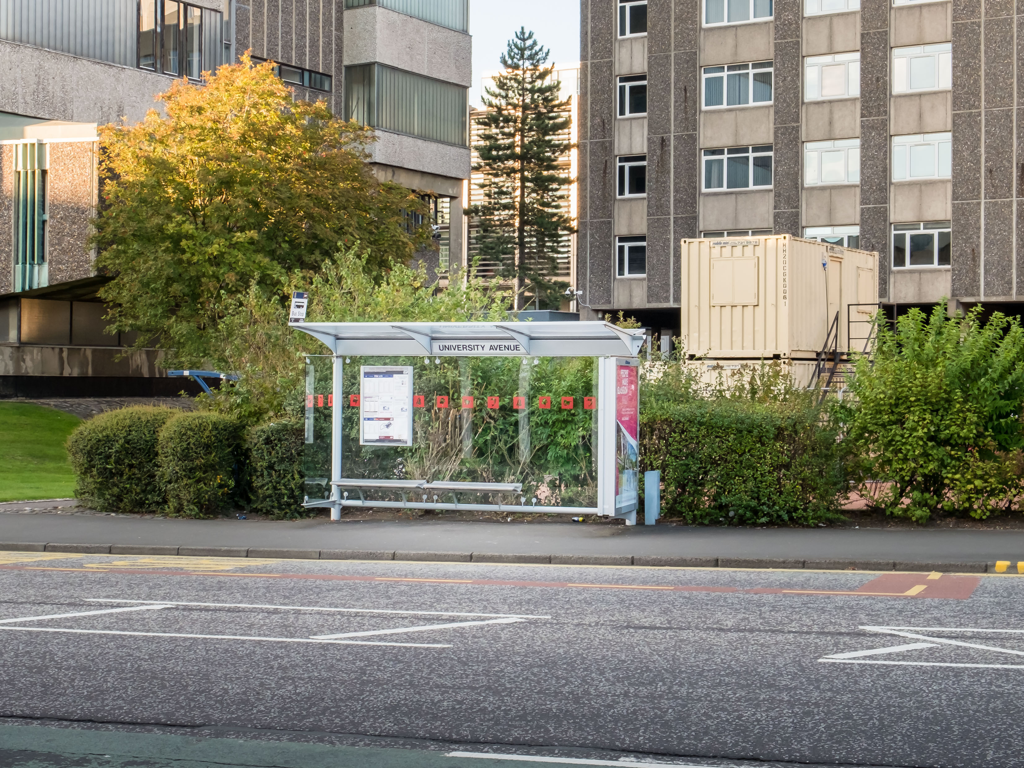
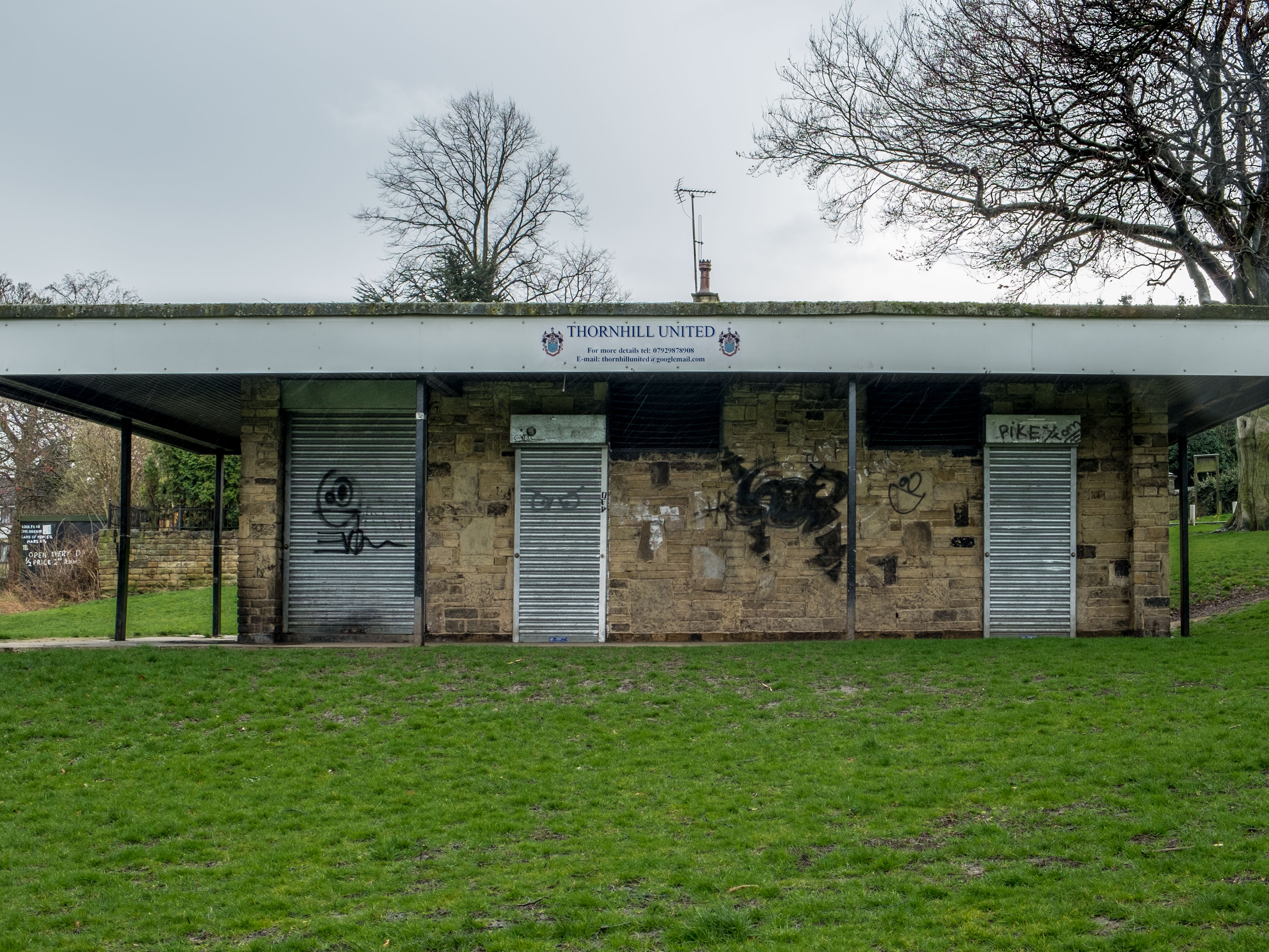
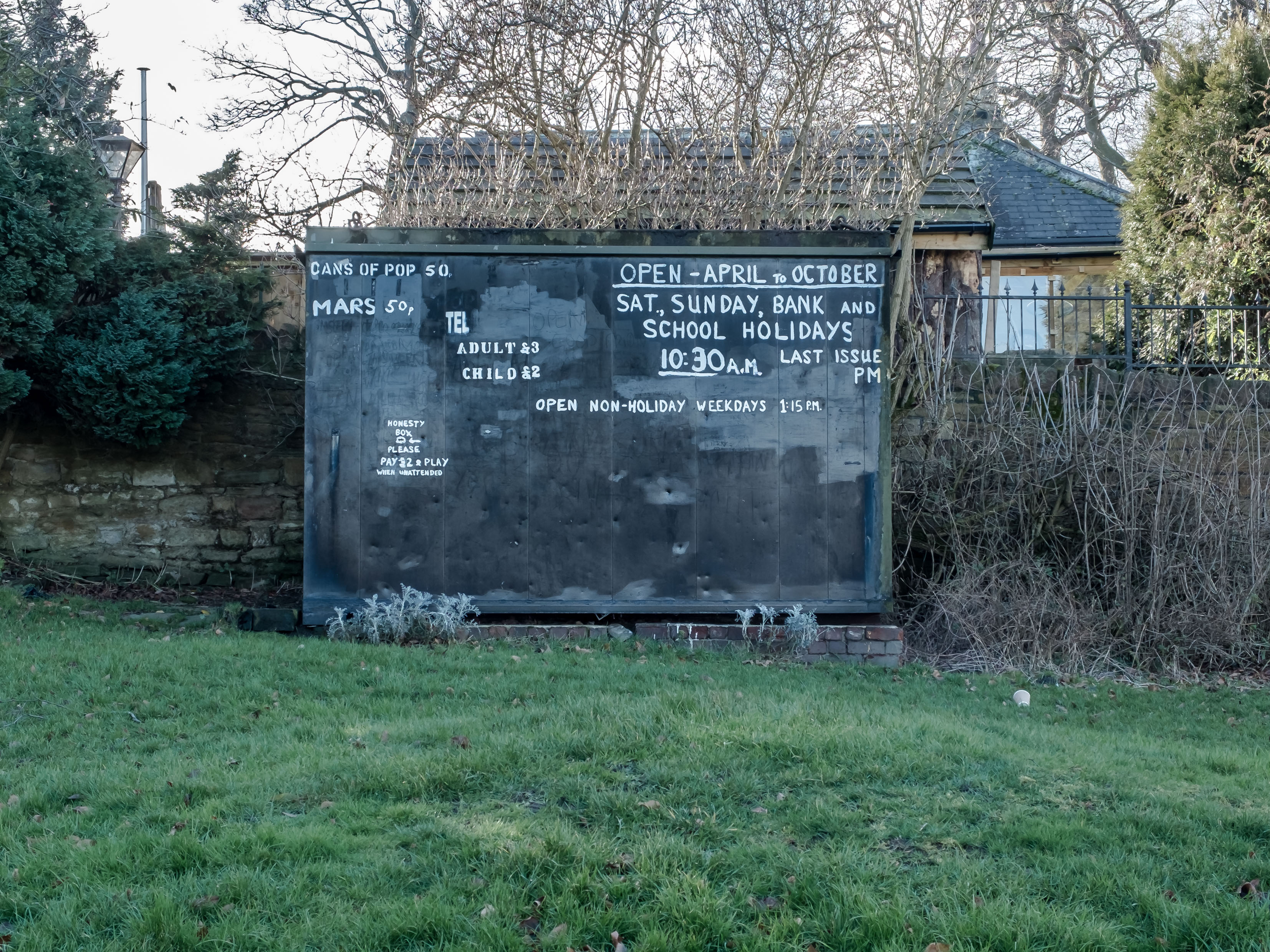
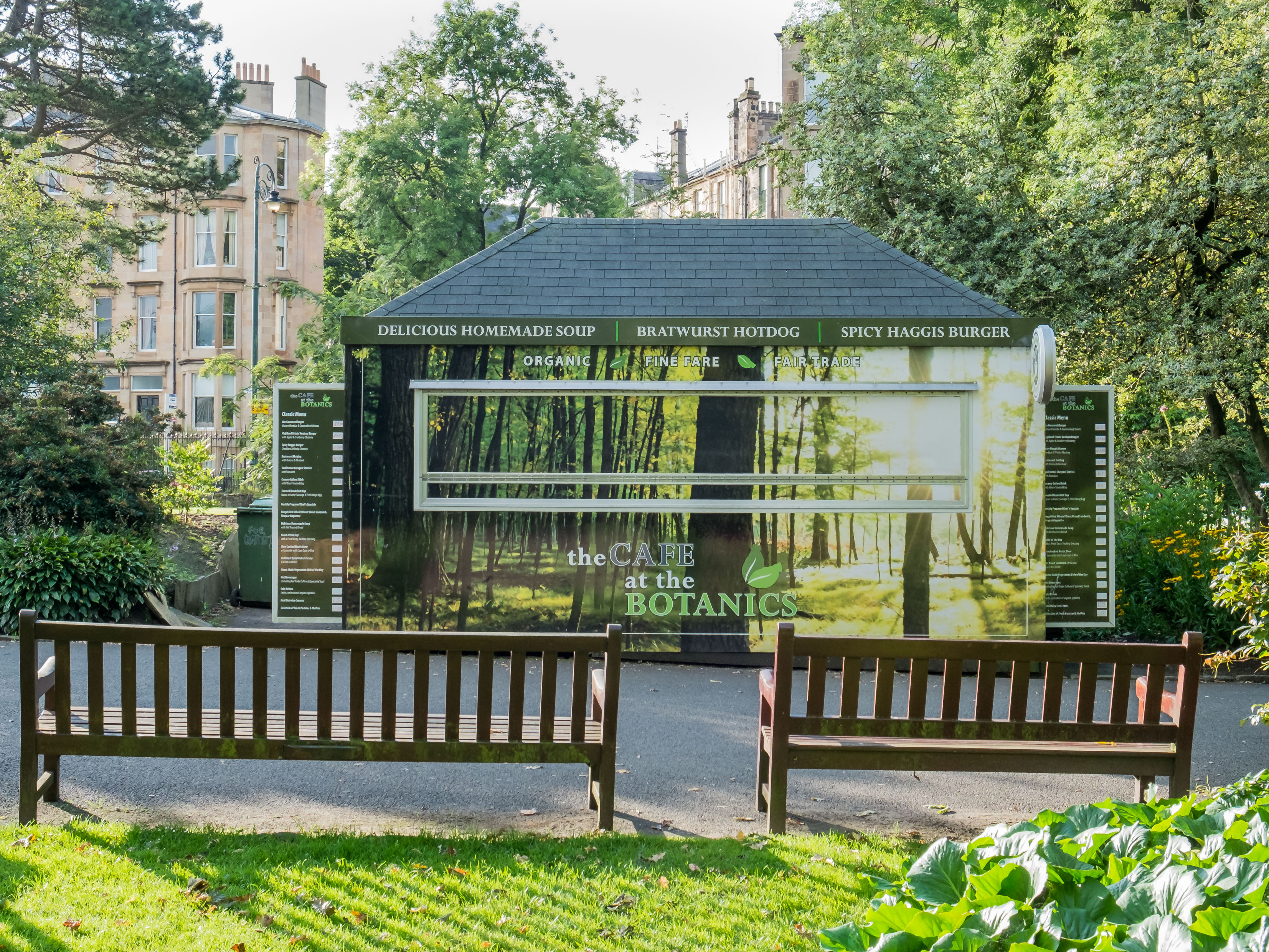
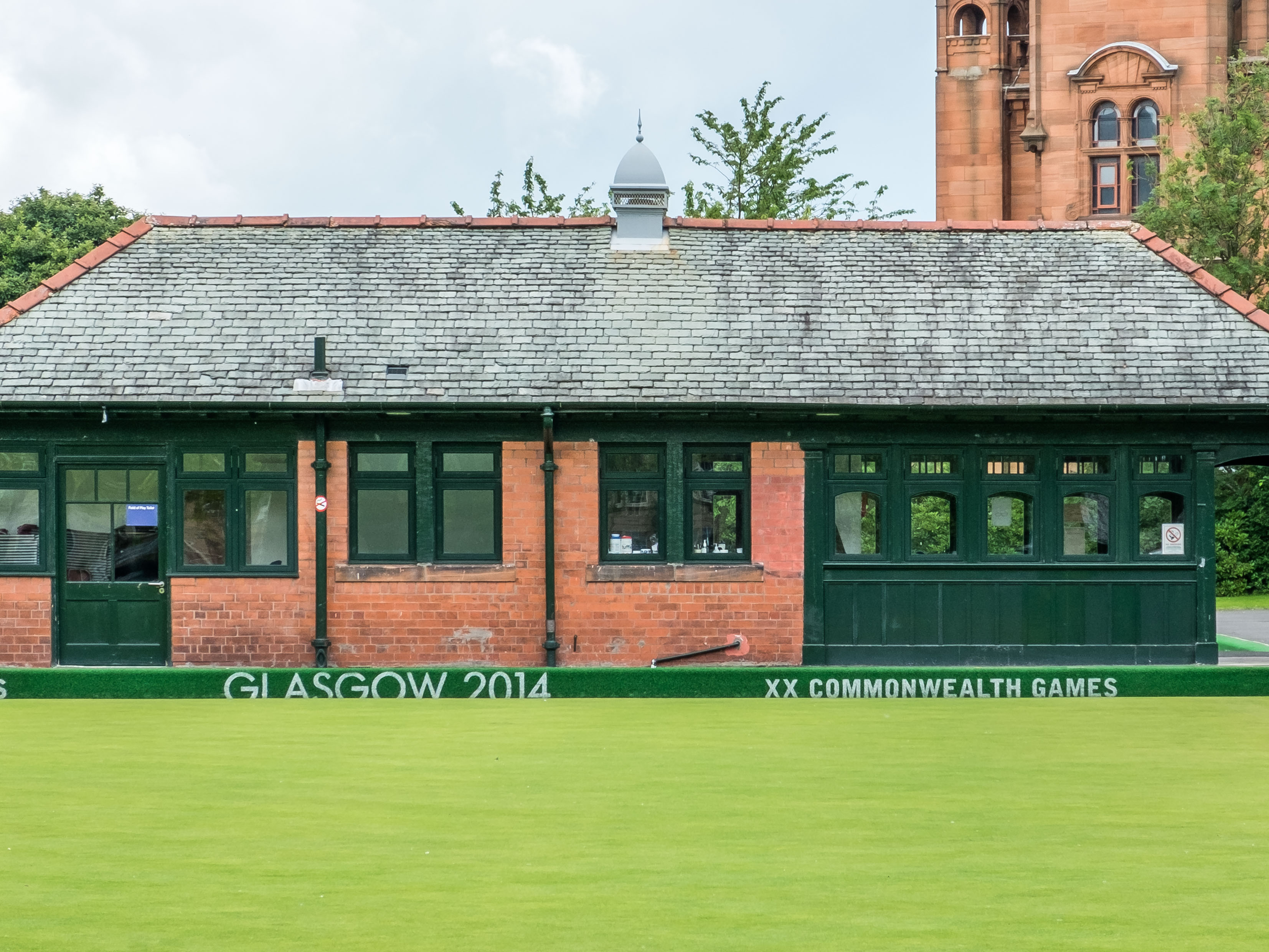
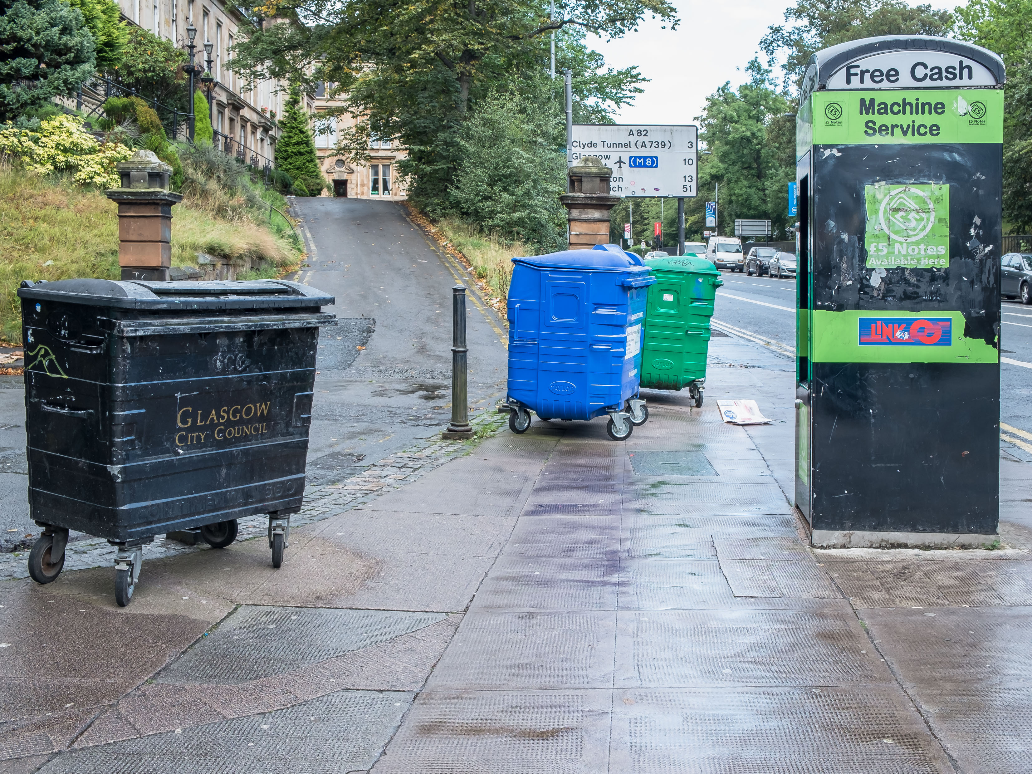
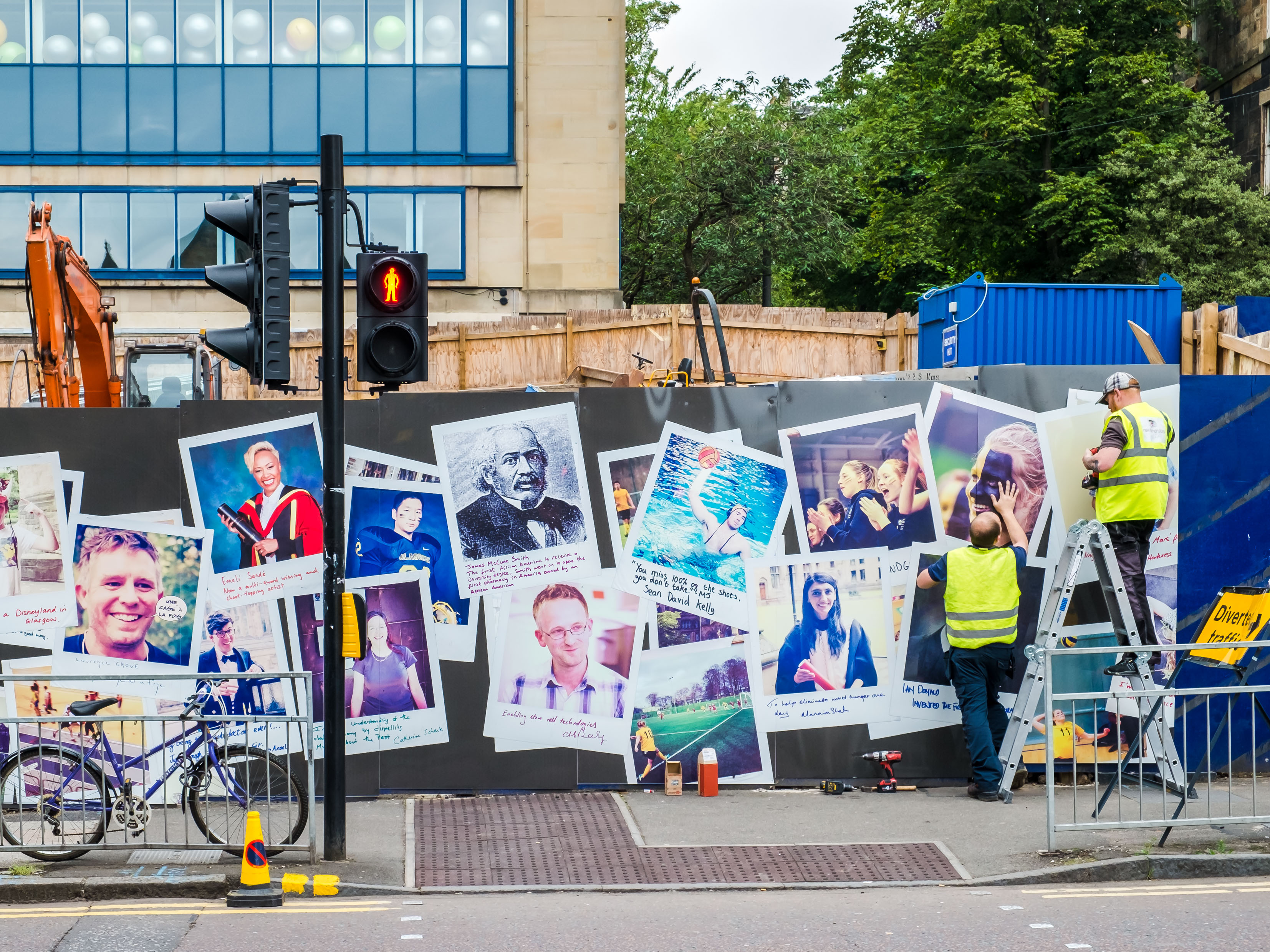
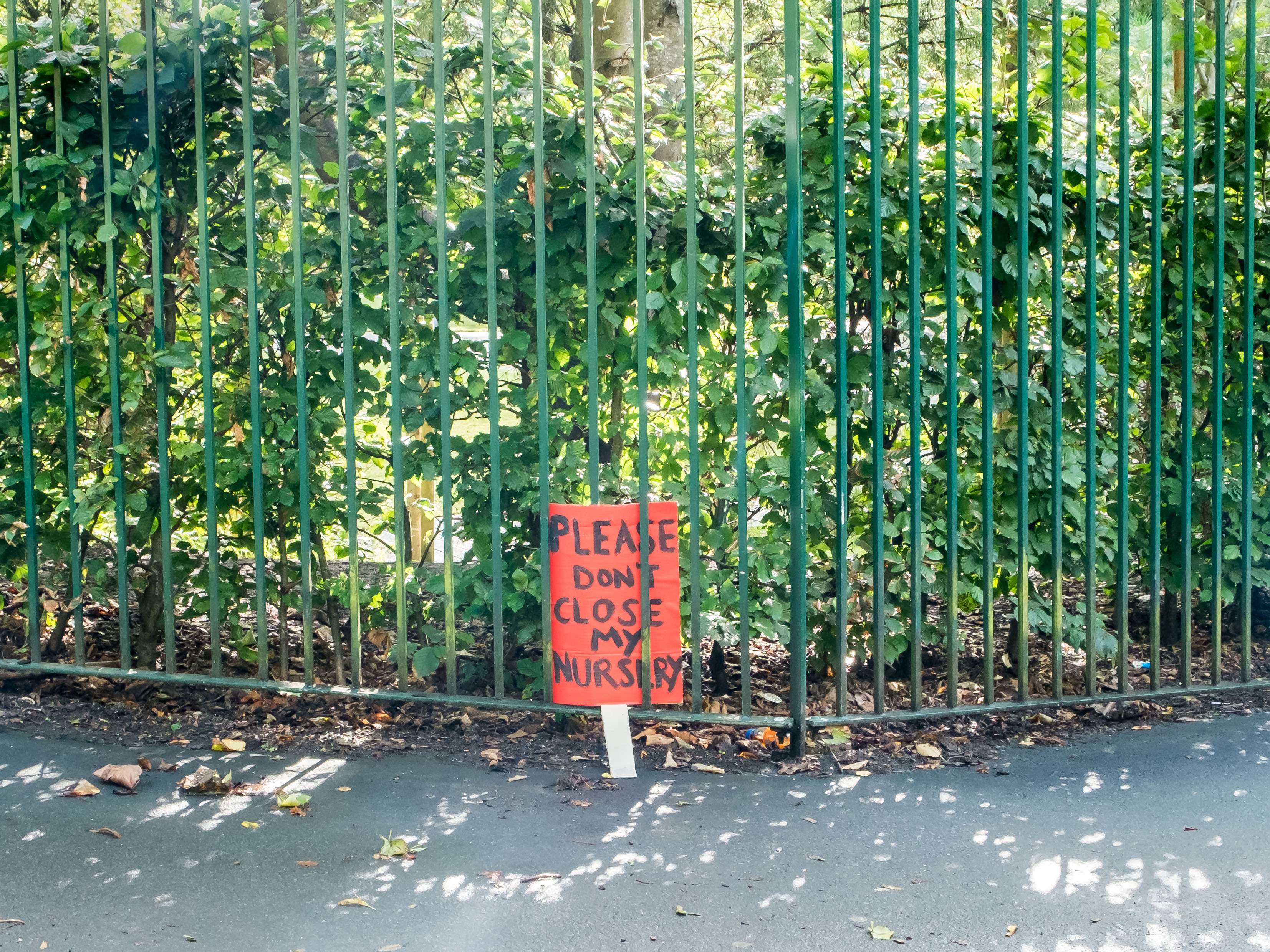
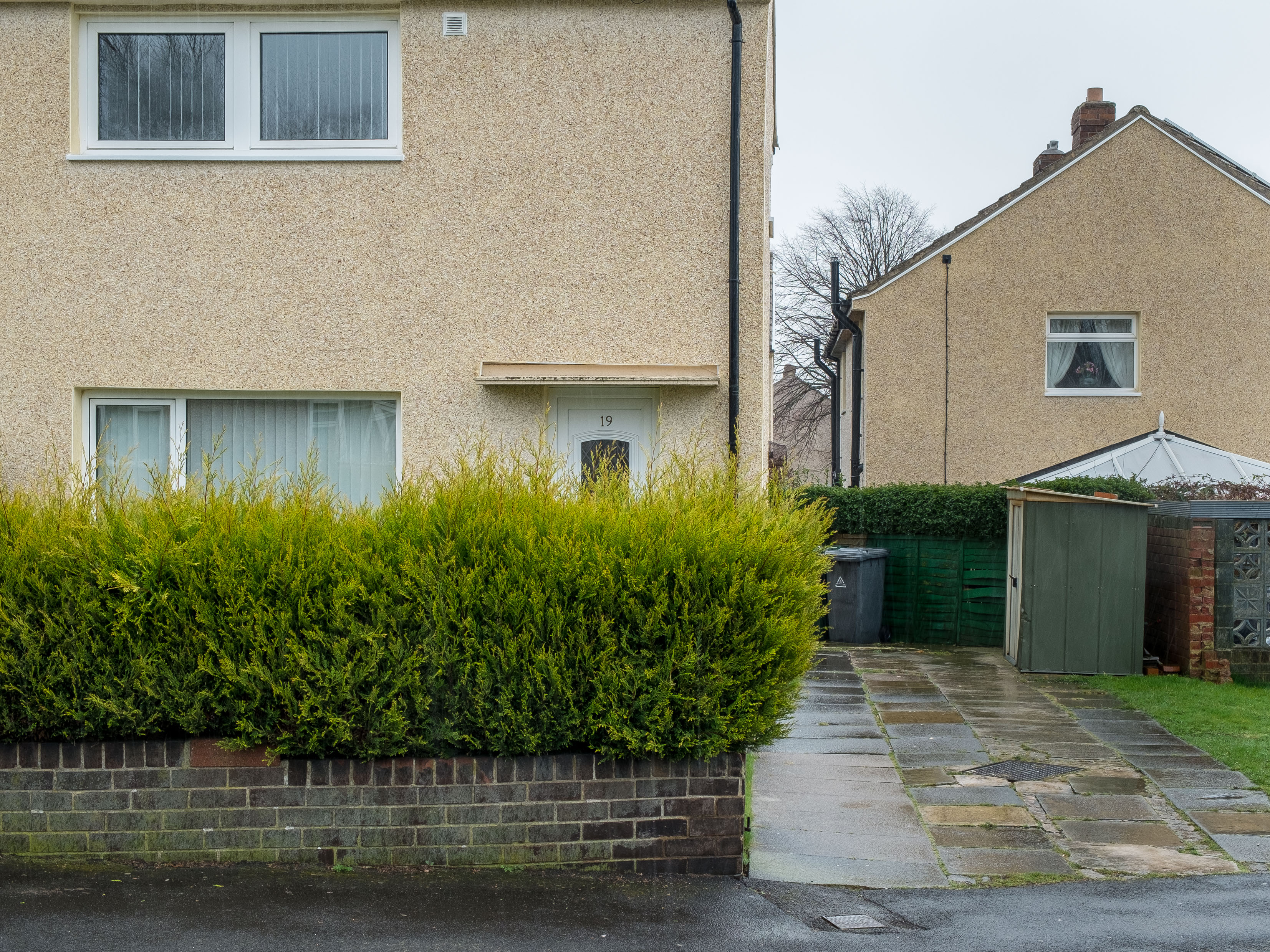
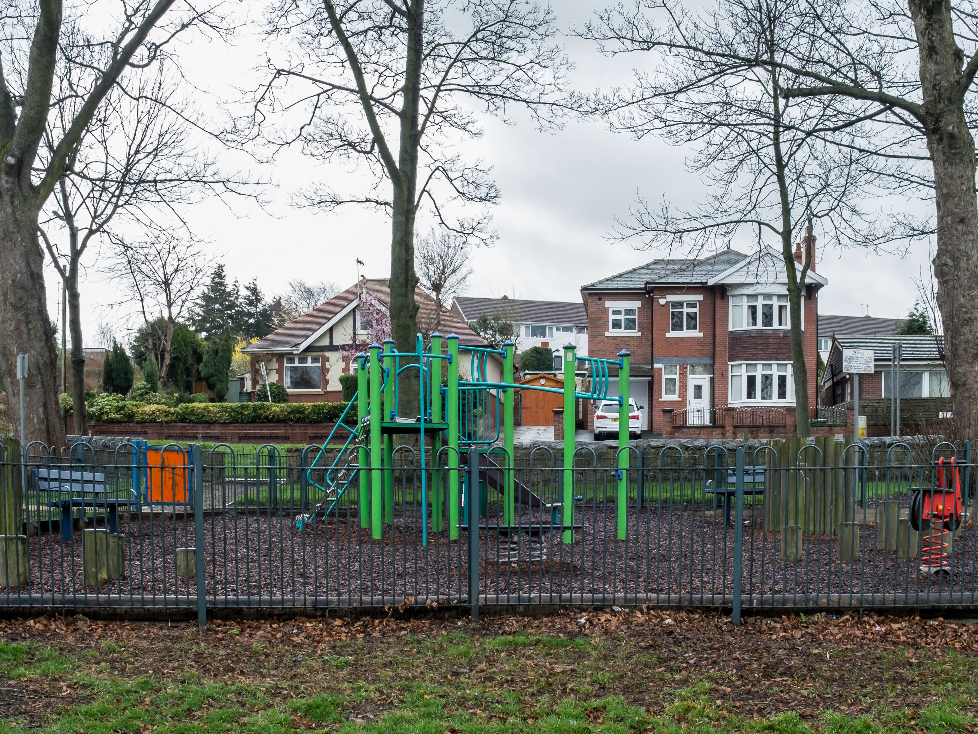
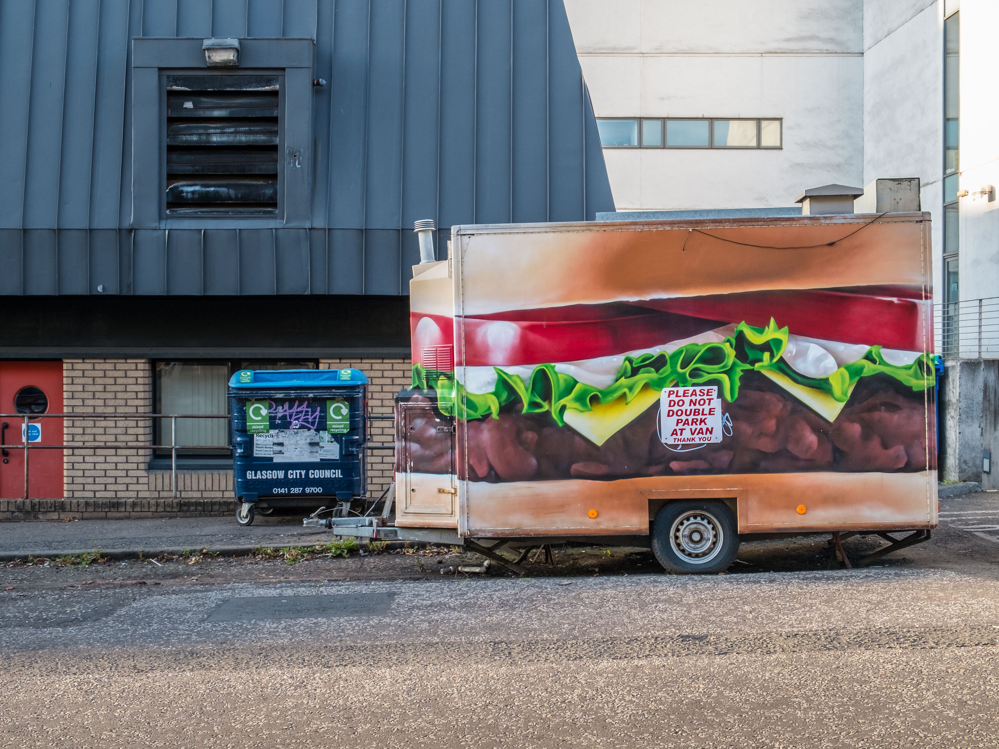
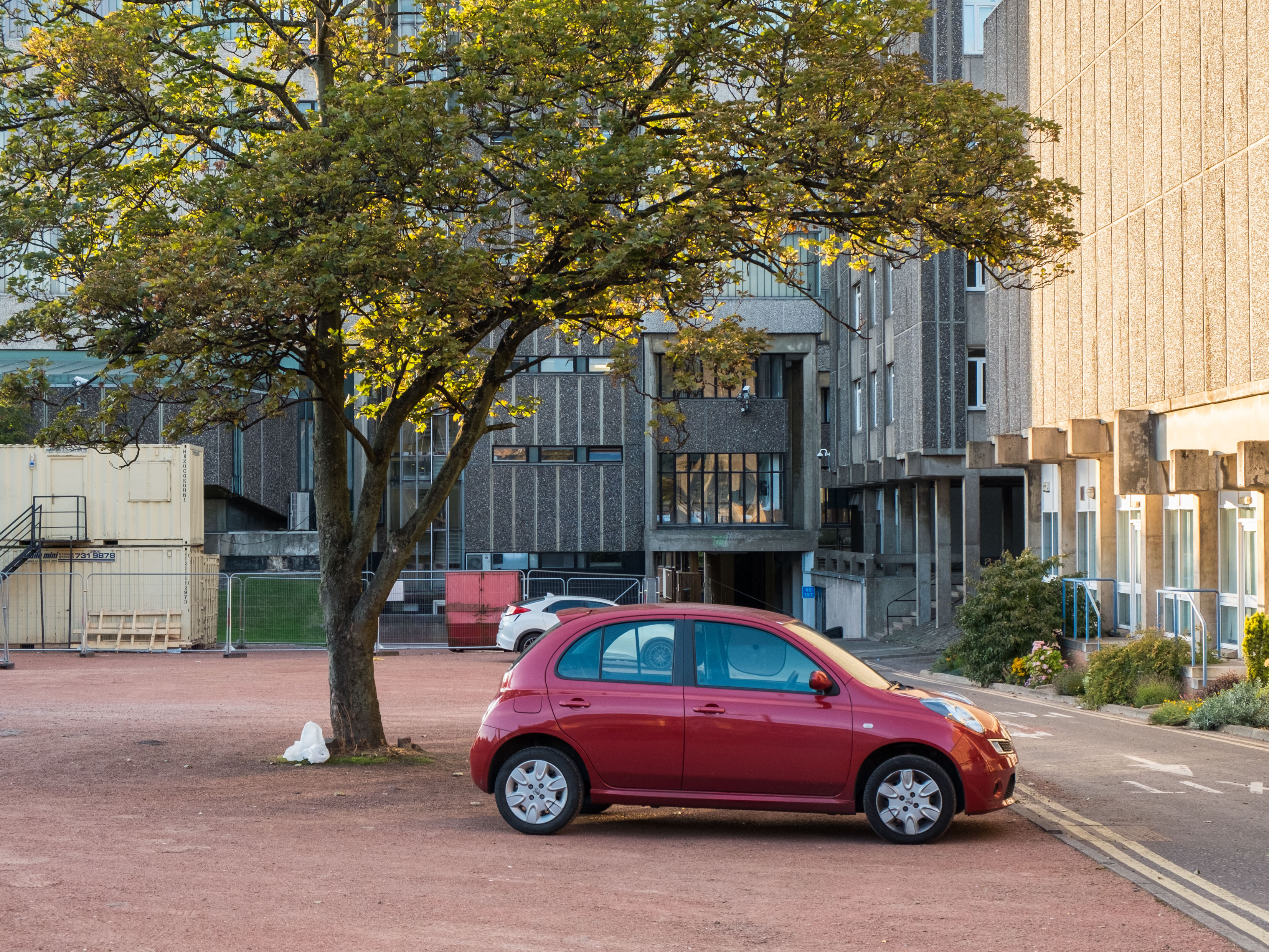
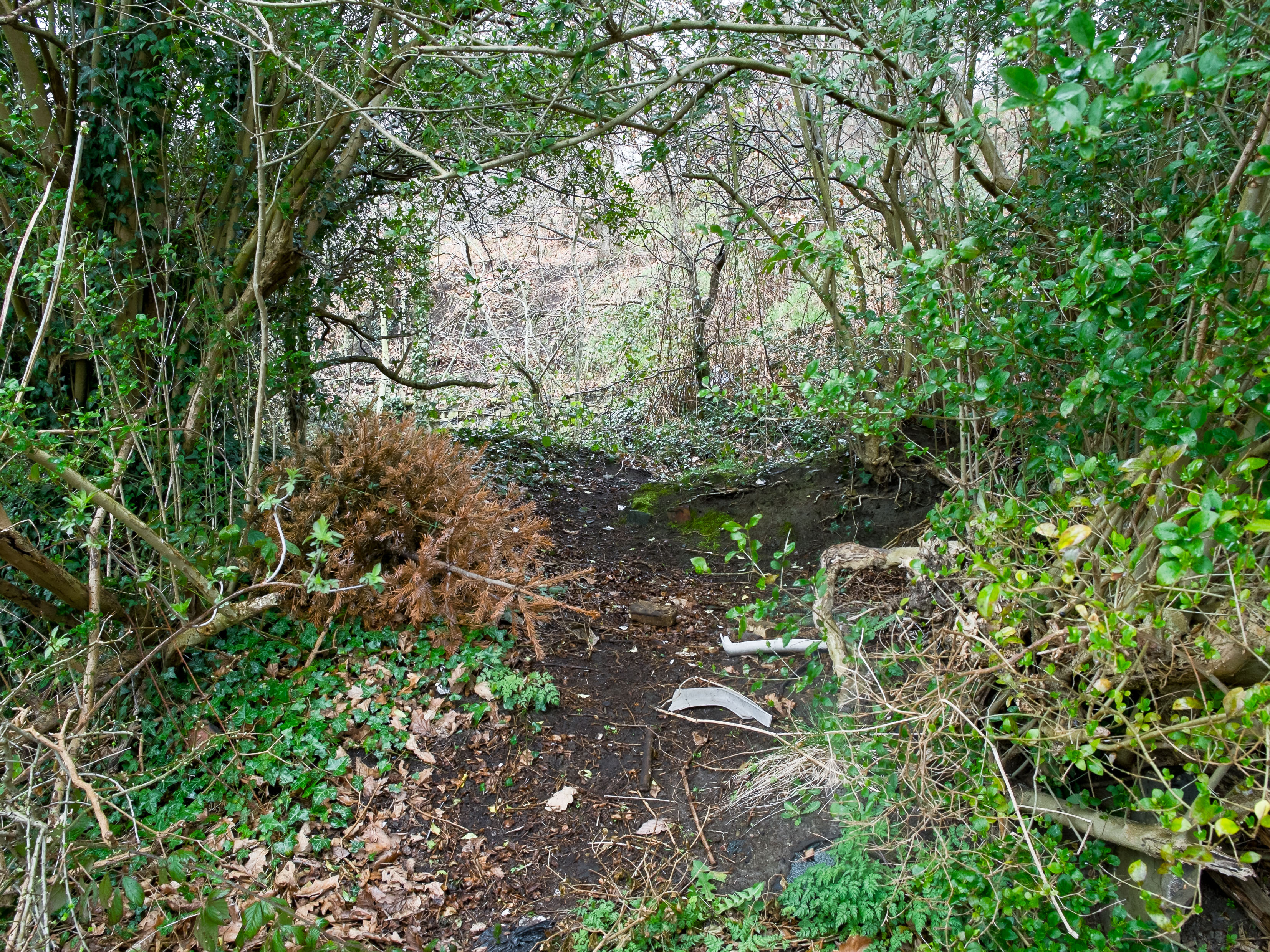
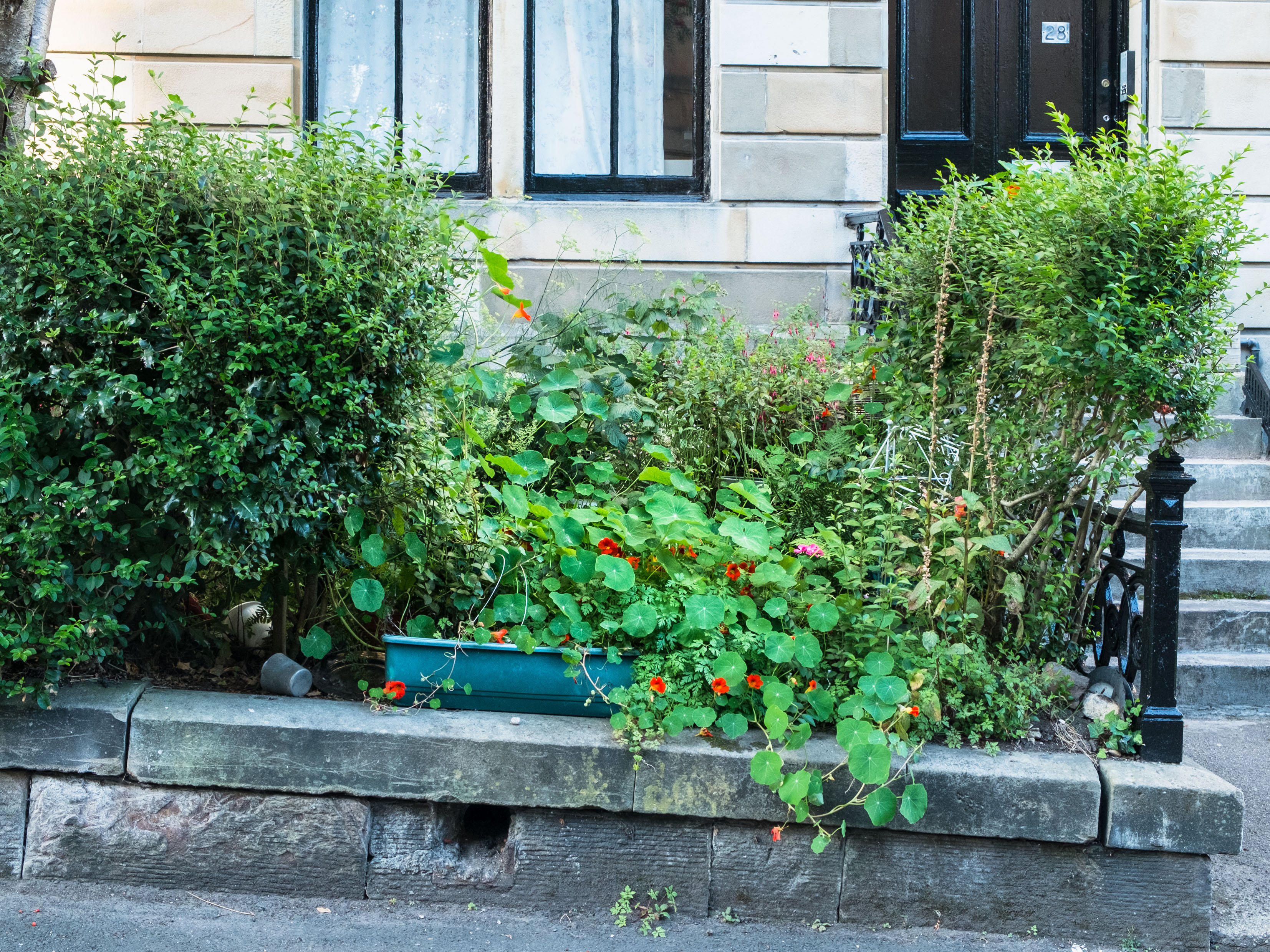
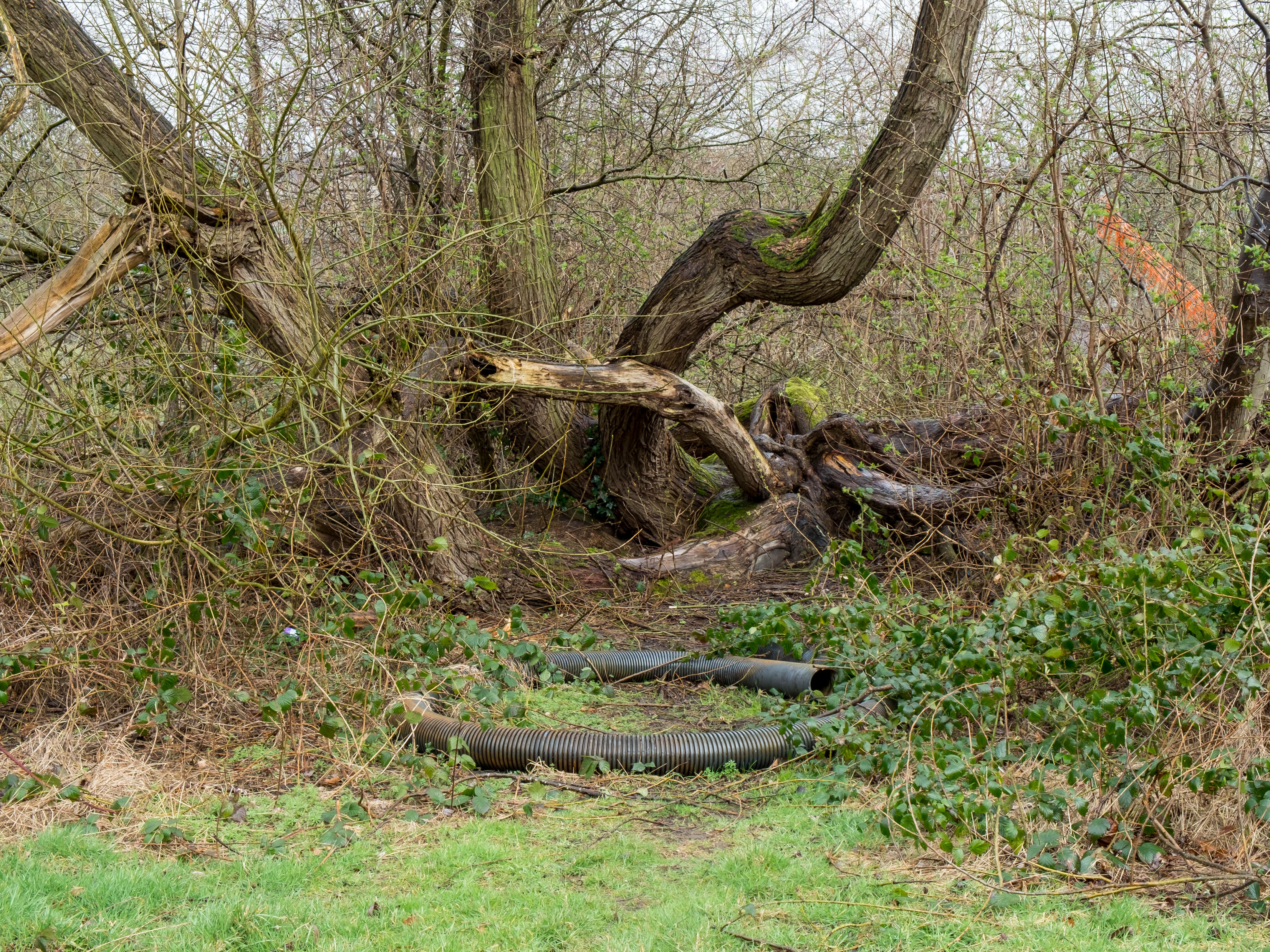
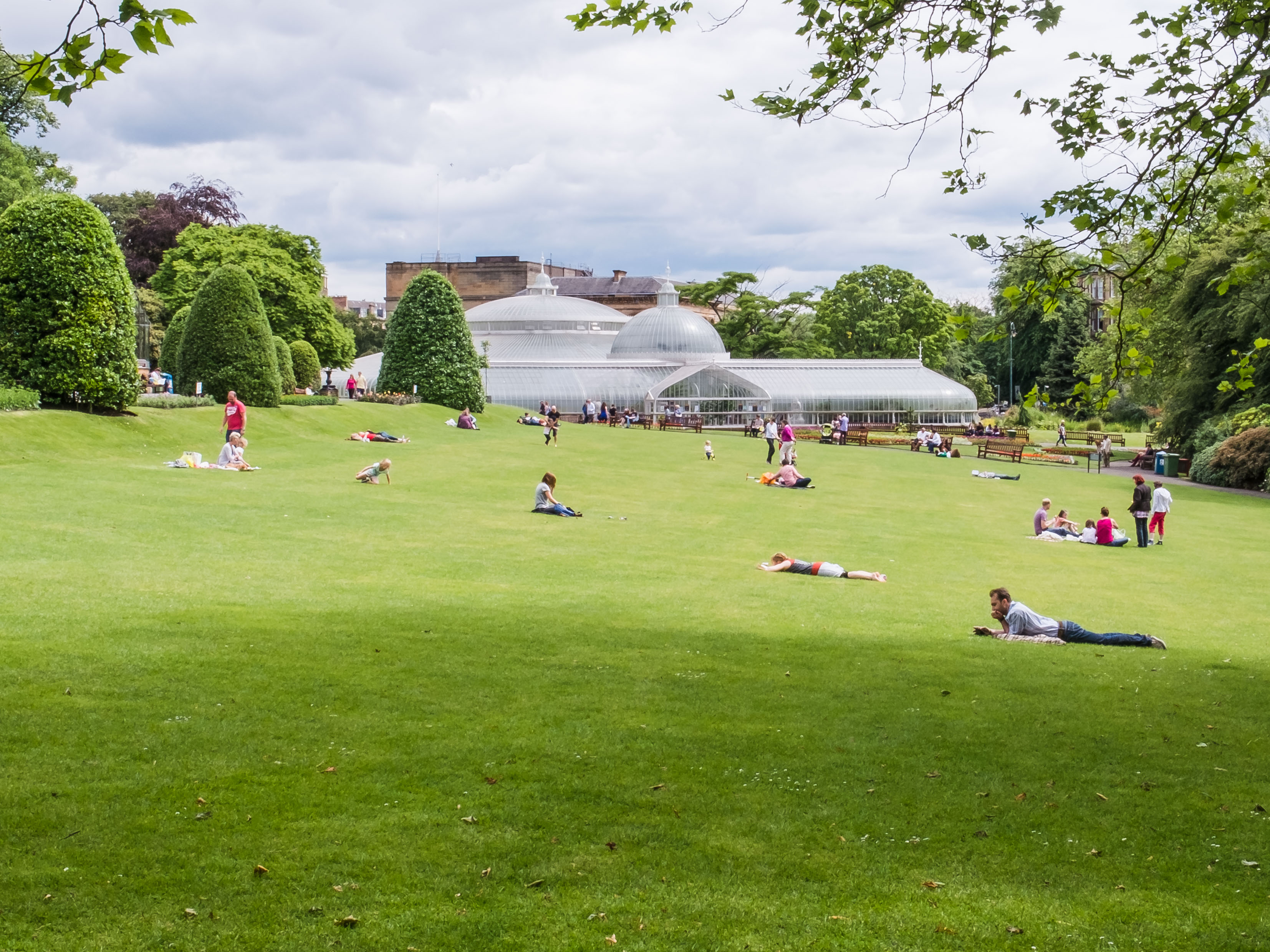
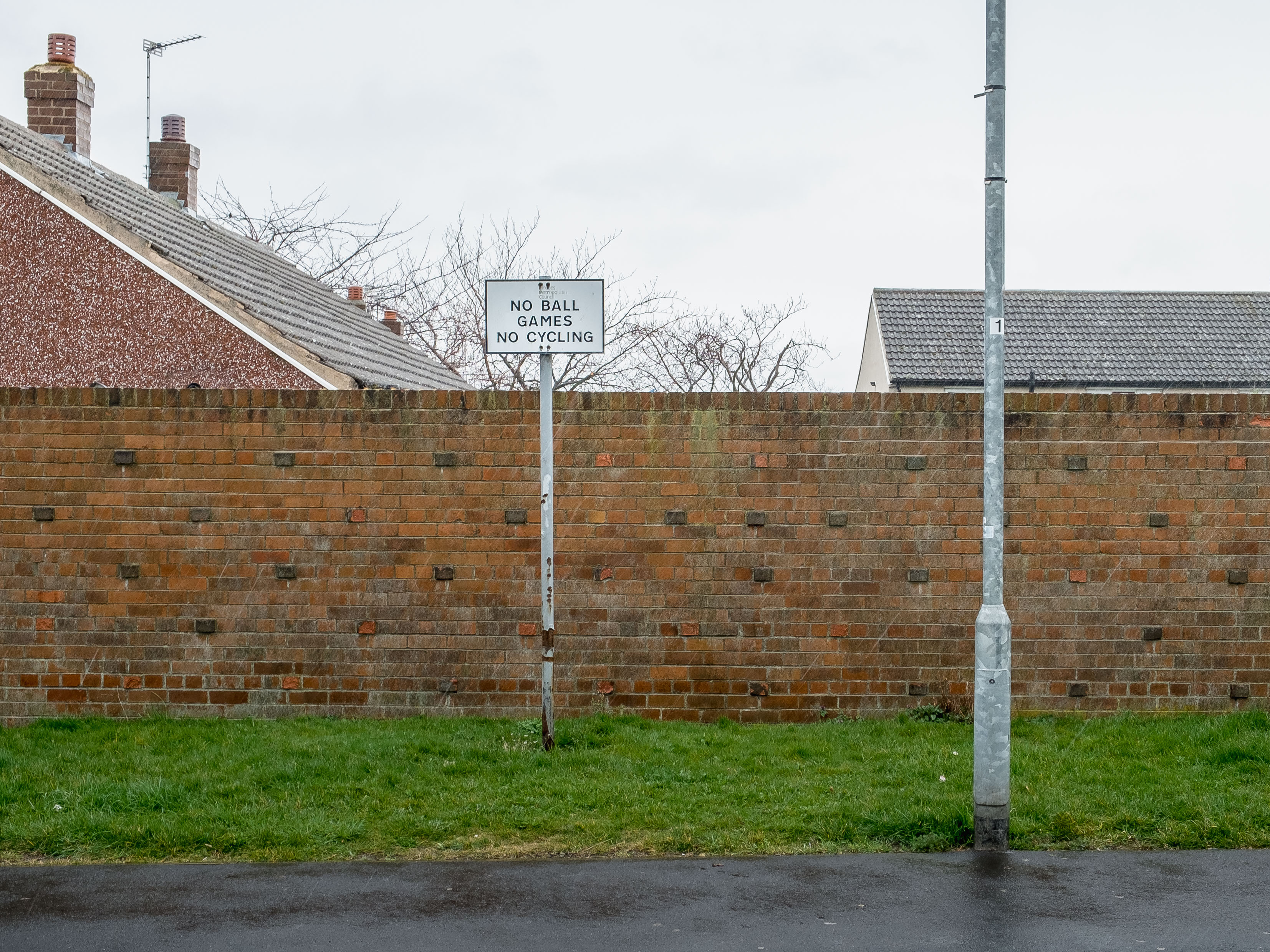
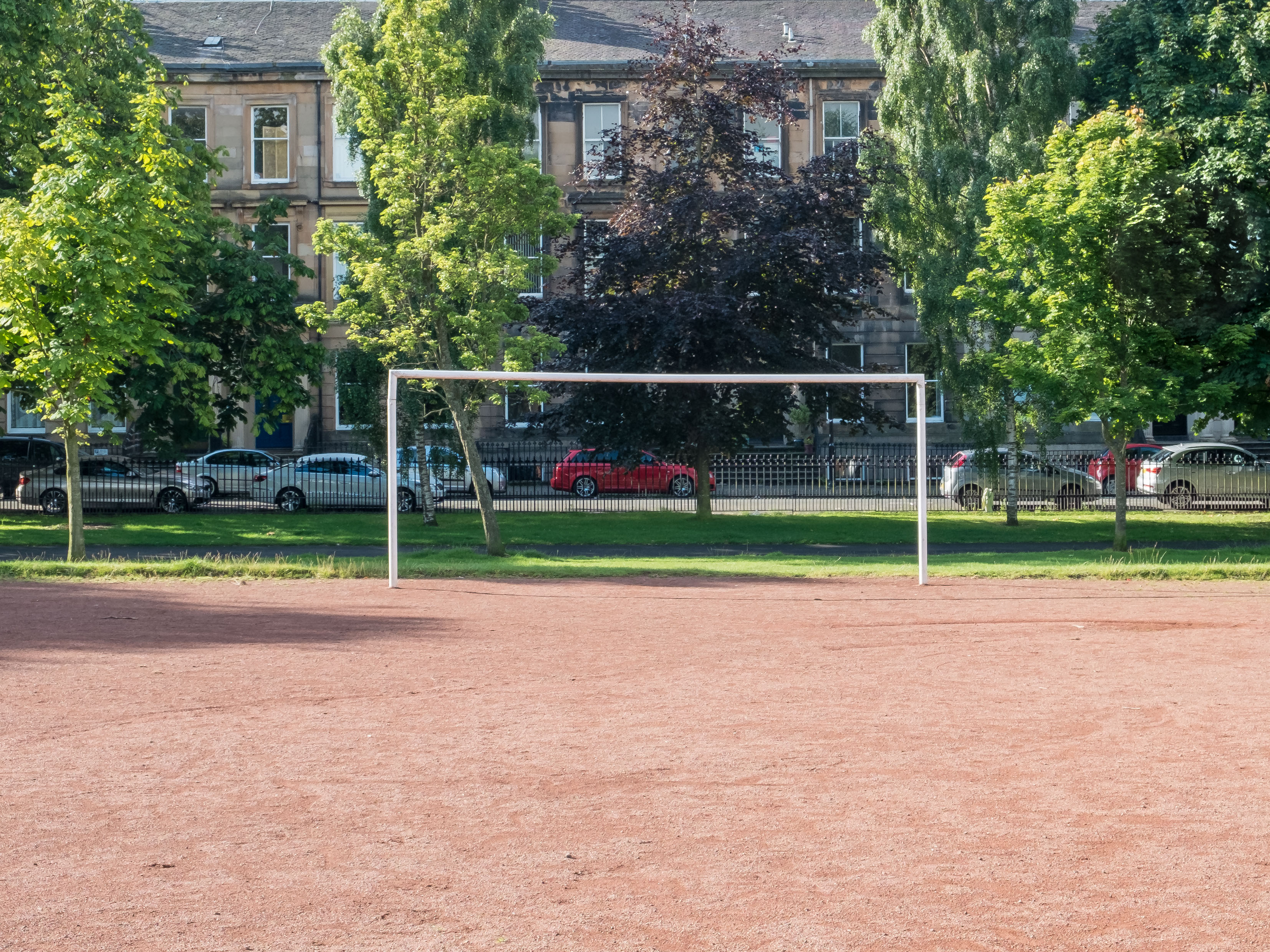
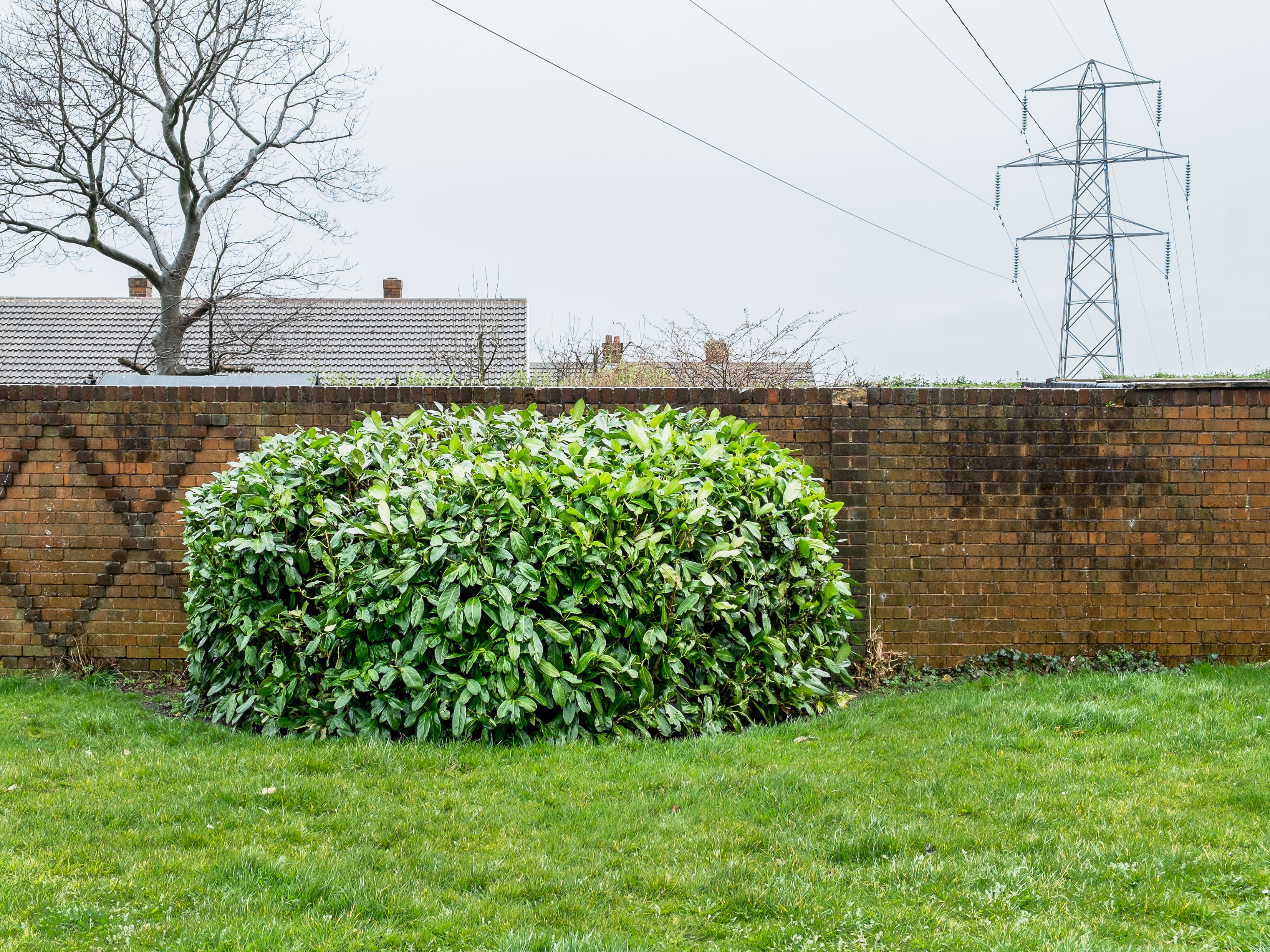
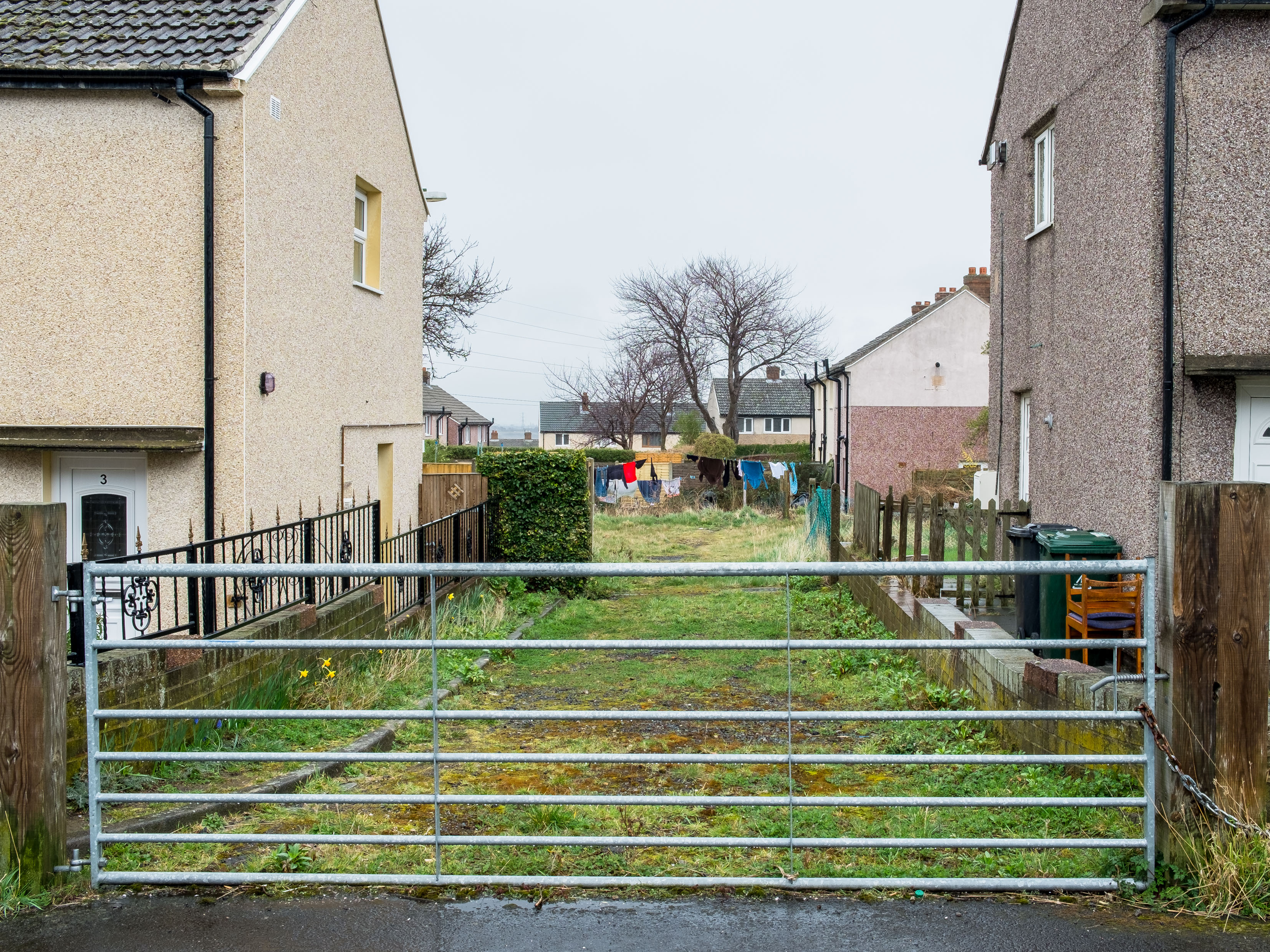
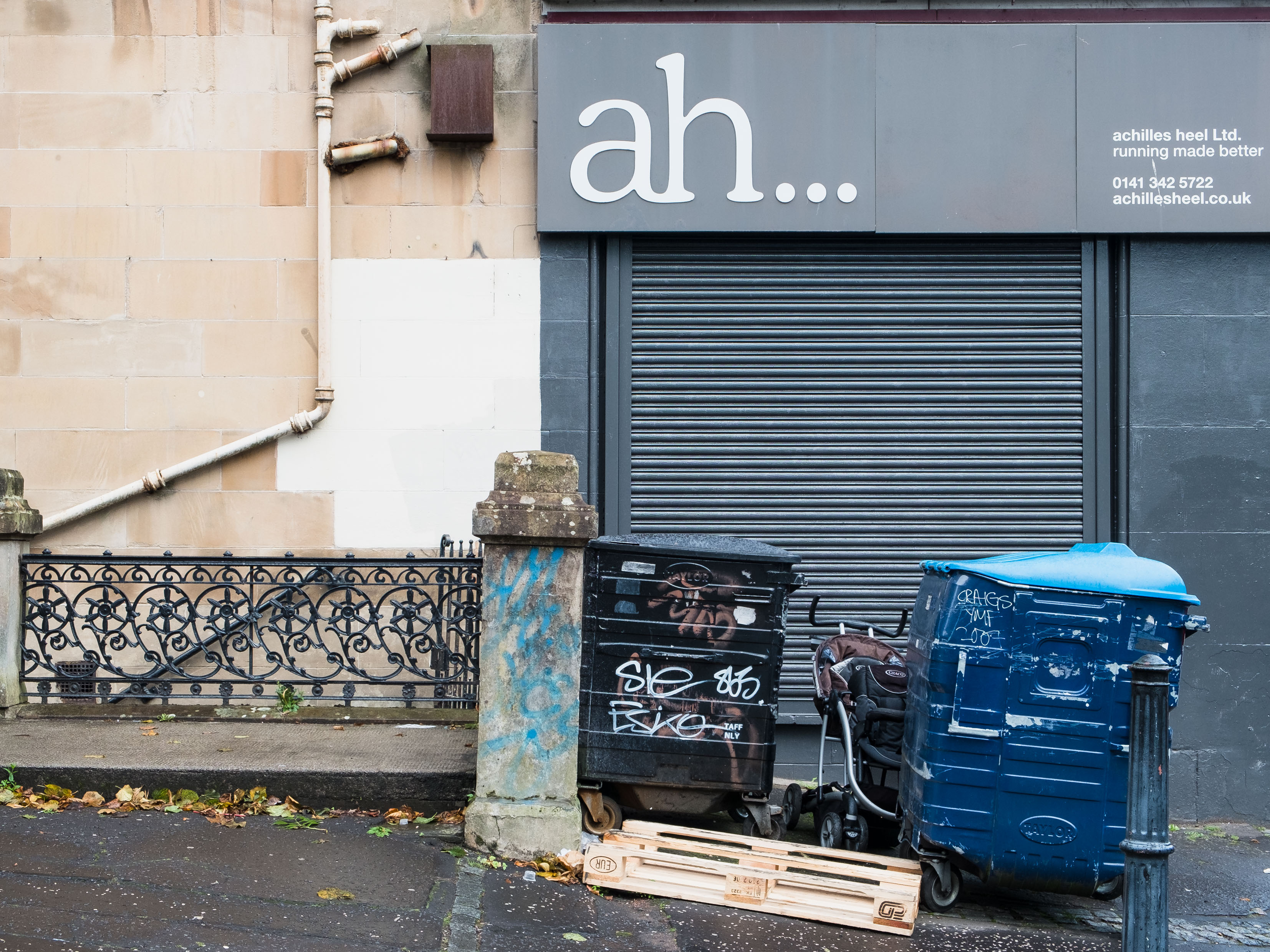
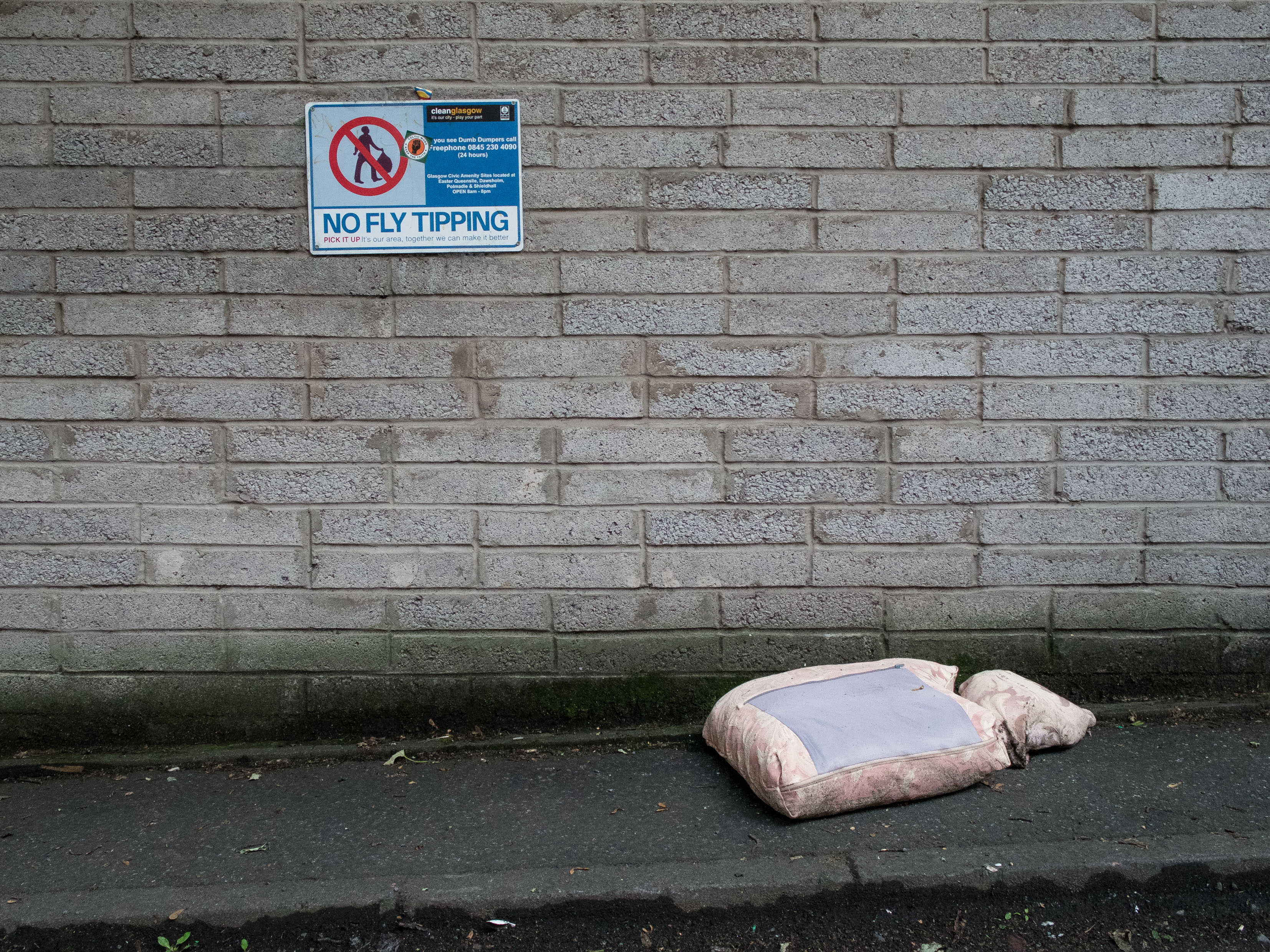
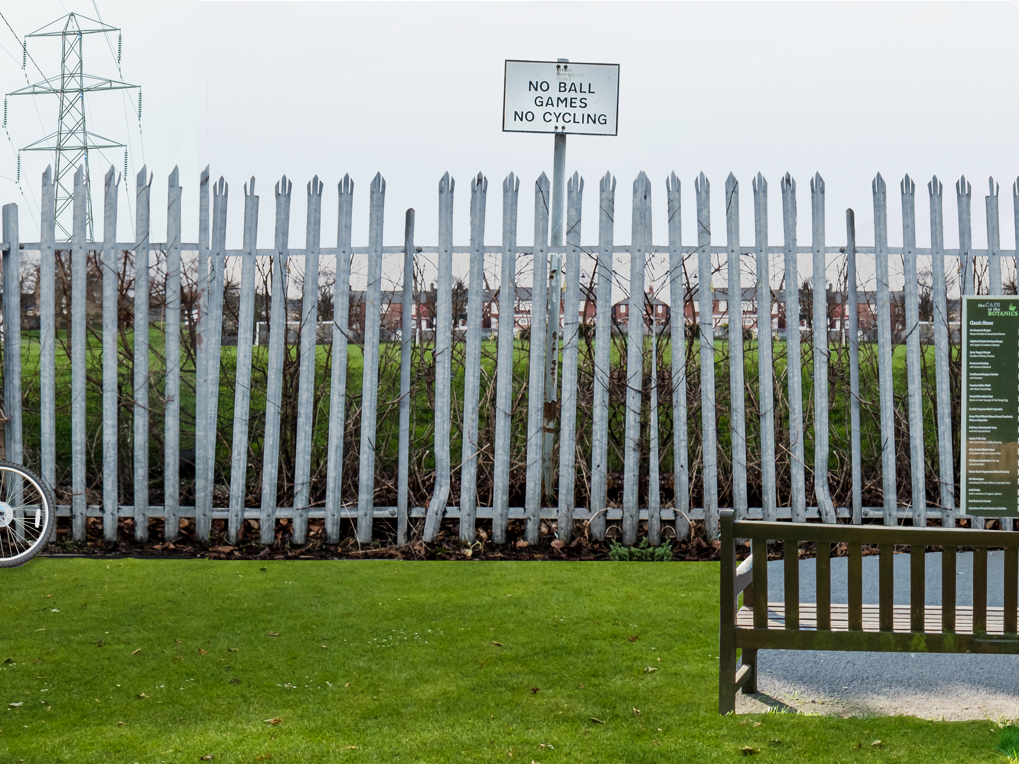
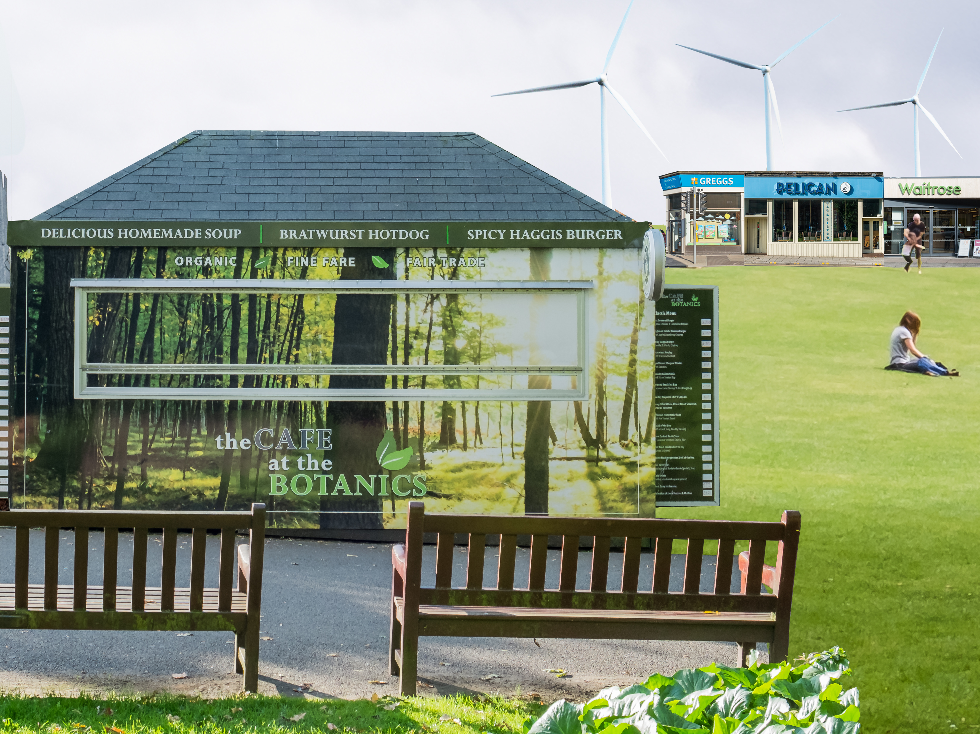
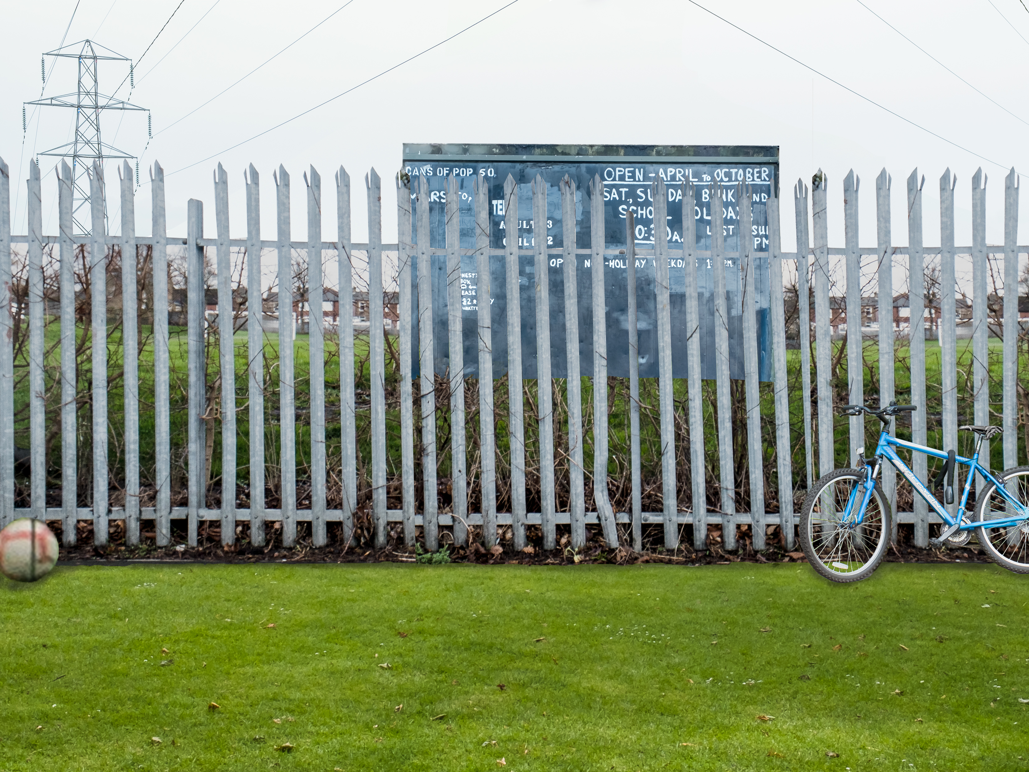
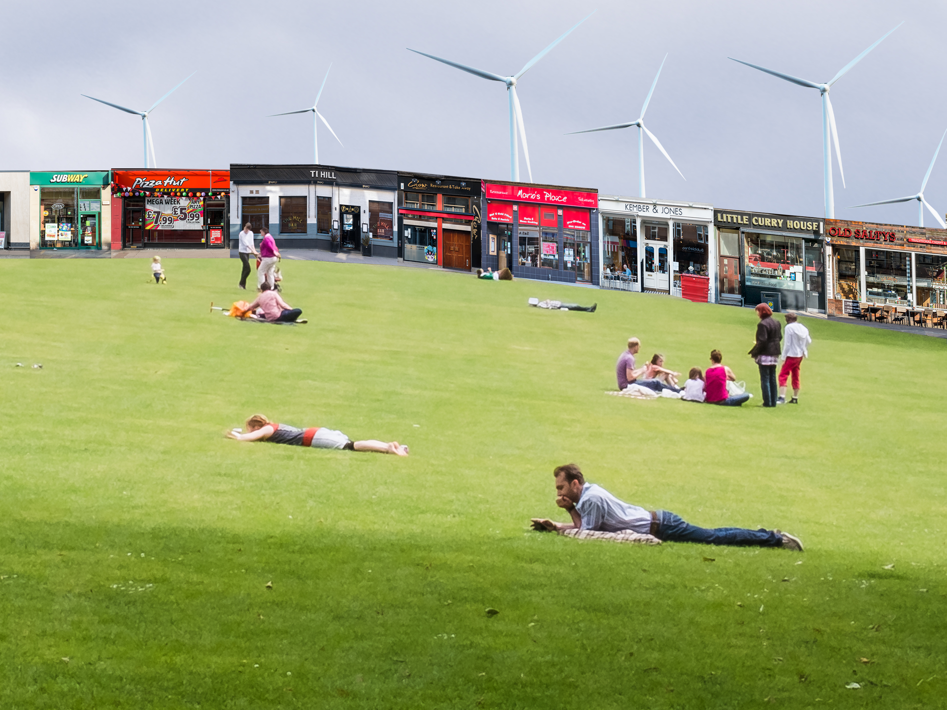
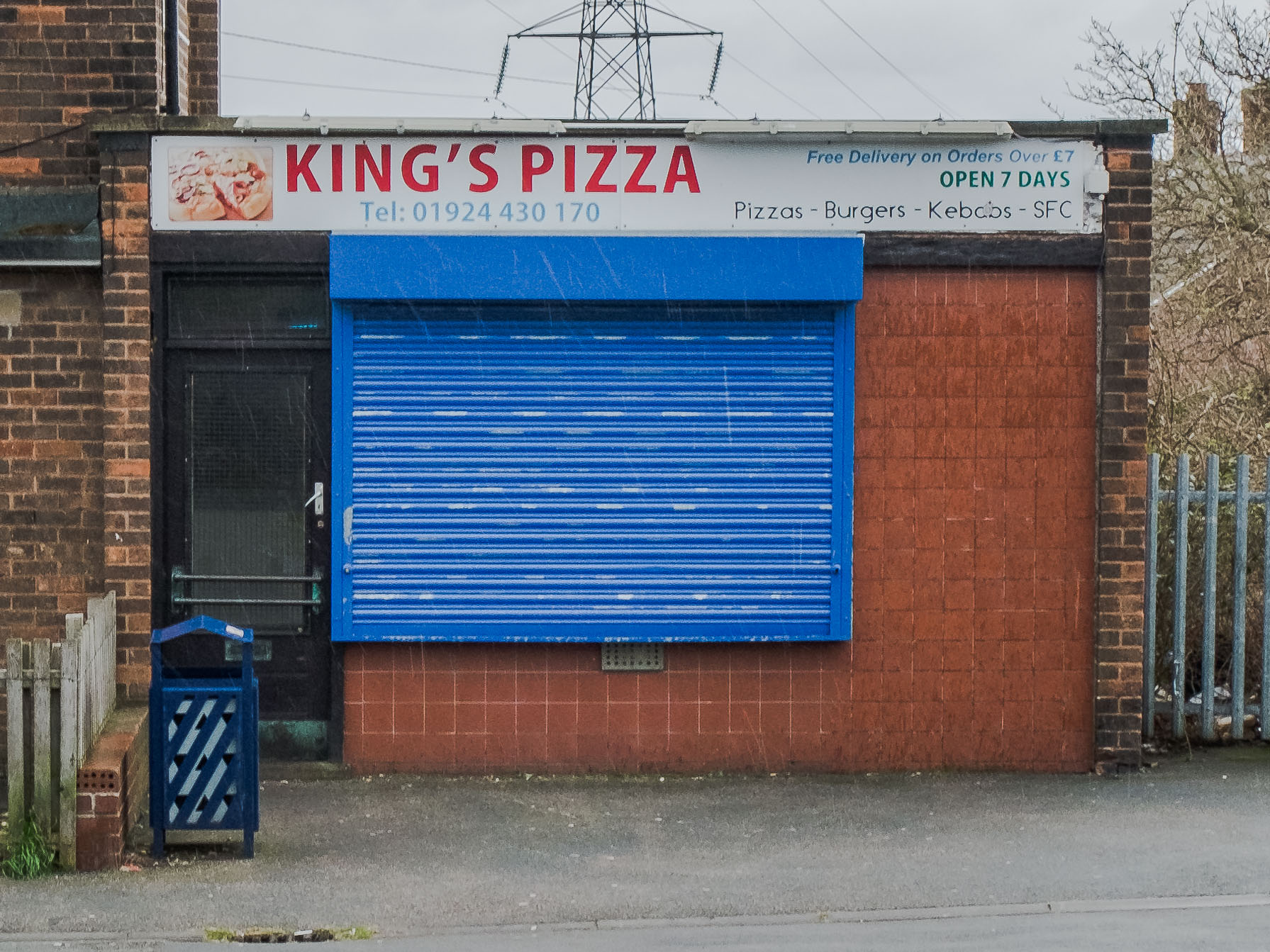
The Body of Work is predominantly contained within the book dummy which folds into a four page layout: one half contains images from Thornhill (the place where I grew up), and the other half from Glasgow (where I recently moved to). The intention is for both the left and right side pages to be turned together so that accompanying images and text can be viewed together across the four page spread.

Only very minor changes were made to the book dummy between Assignment 5 and this Assessment Submission; therefore, as they are virtually identical only the final version is included in this submission. The one change that has been made is the use of lay-flat binding in this final version – trialled to inform any future refinement as part of ‘Sustaining Your Practice’.

A selection of A3 prints have also been included as part of the overall submission.


All I have got to do now is start the final module, and move house for the third and final time.

I will probably post a link to the next module once I have set it up, but for now thanks for everyone’s support both online and offline which has been invaluable in getting me to this stage – I special mention to Stan who’s encouragement has helped me get over the line.

Bye for now.


Leave a comment

BoW: Assignment 5 Submission

This was my initial submission for Assignment 5 of Body of Work, which after further discussion with my tutor we agreed that a hard copy of the joint book would be better to help my tutor to understand what I was having difficulty in describing.
The submission was split into two books; one for Thornhill and the other for Glasgow.  Whilst they are separate books, they are best appreciated when opened together and viewed as a four page spread.  My intention is to physically join these books together along one edge so that they can unfold into this four page layout.  To create this, the Thornhill book is designed to be read from front to back, whereas the Glasgow book is intended to be read from back to front, and as I say, the ultimate intention is that each double page spread for Thornhill has a corresponding double page spread in the Glasgow book.  I have tried to explain this in an earlier blog post on Assignment 5.
The two books are Thornhill book and Glasgow book
It is also worth mentioning that since Assignment 4, I had the opportunity to present my work at the Barnsley student residential and a couple of further Scotland Study Group sessions, which both confirmed my growing sense of the work  that it needed something a bit more to lift the work another level.  I was encouraged to take what I thought at the time was quite a substantial risk in changing the work so late on between Assignment 4 and the final 5th Assignment – thinking that if you do not like it then I will be in trouble at such a late stage in the process.  You will probably be pleased however that having worked on it for quite some time I am now comfortable in taking this forward as my final outcome for Body of Work, and less inclined to worry about ‘what my tutor might think’.  It has been an interesting journey and hopefully you will agree a fascinating outcome compared with where I might have started – and could have ended up!
In terms of next steps, I will obviously look forward to, and appreciate, any comments you may have on this work, whereby I will then intend to create a dummy hardcopy version of this book for Assessment purposes before then creating a more professional, high quality book as part of the final module – more of which I describe in the evaluation document.  On that, I have also included with this assignment a copy of my ‘Introduction’ and ‘Evaluation’ associated with this work.


4 Comments

Final Catch-up

Well, it’s been quite some time since my last post which was around the time of my final assignment submission back in December.  After the effort of finishing Body of Work just within the two year deadline; whilst also having quite a stressful time over that two year period of moving house twice, getting used to a new Country (Scotland), and putting all my efforts into a rather busy new job, I felt burnt out having achieved this academic milestone.  I thus decided to have a break before deciding on  my next steps, which has admittedly lasted much longer than I initially intended, but is still something that I needed.

In this time I have also been giving quite some thought into whether I wanted to continue or had I come to the end of the journey with these studies.  I have never intended to become a practicing artist and thus my focus has been on the academic challenge that this course has provided, whereas the final module seems much more attuned to the former. This is something I am still battling and struggle with its value to me, however, for now I have decided to get up to date with this blog, tidy it up, and get ready for assessment (I have just missed the last one so have to wait until later this year, or enter all modules together once they are all finished).

So the next few blogs will be a catch-up to make sure all the assignments and assessment submission documents are available, and any other relevant posts in-between.


Leave a comment

Assignment 5 Book Layout

This post is in preparation for submitting my 5th and final assignment for my Body of Work.  As previously mentioned, the work is now split into two books which are then connected along one edge and then folded to create a single book.  My intention at the moment is to send my tutor a PDF of each book and then use the following to explain how they work best when viewed together over a four page spread. Once I have gained feedback on this I will then create a physical ‘dummy’ of the combined books ready for assessment, and then take it to a more professional level within the next module.

Before I start with the layout, I just want to acknowledged that whilst the following shows my intended experience of viewing this book, the advantage of the final product will be that the viewer can decide for themselves how they want to approach it.

The following is the front cover for the combined book, which will have the title ‘Land Values’ below it.  To make this work, this front cover will actually be printed onto the rear cover of the Thornhill book (its how the folding works):

Home

When opening this cover you will be presented with two further covers, one for each book.  Physically, the one on the left will be the front cover of the Thornhill book, and the one on the right will be the rear cover of the Glasgow book (confusing I know, but please bare with me).  The text introduces the concept of values to the way we might value land:

Land Values text pageLand Values text page

From now on, the Thornhill book (left) will be read from front to back and the Glasgow book (right) will be read back to front – to create the following comparative four page spreads.  For this next spread, the blue page is the inside cover and the text is the inner title page alongside my name:

Land Values blue pageLand Values text pageLand Values blank pageLand Values blue page

In this first spread the text introduces the two places of Thornhill on the left and Glasgow on the right:

Land Values text pageSpa ShopParadise is ...Land Values text page

The following shows all the other four page spreads, noting that I have highlighted where text will be placed but the PDF of the final product will need to be viewed to see what the text is.

Shops 4 page spread

Cricket buildingGold buildingLand Values images-5Land Values images-4

Park slopePondLand Values images-7Paradise is ...

Land Values text page Path junctionParadise is ...Land Values text page

Frank Lane Land Values blank pageLand Values blank pageLand Values images-9

Land Values text page Fence and playing fieldsLand Values images-10 Land Values text page

Land Values text pageLand Values text pageLand Values text pageLand Values text page

Land Values images-29 PlaygroundLand Values images-12 Land Values images-11

Land Values blank pageDen in bushesParadise is ...Land Values blank page

Den in treesLand Values blank pageLand Values blank pageLand Values images-14

Land Values text pageLand Values images-33Land Values images-15Land Values text page

Shrub and wallLand Values images-35Land Values images-17Land Values images-16

Land Values blank pageLand Values text pageLand Values blank pageLand Values text page

LV Montage_flattened_Thornhill leftLV Montage_flattened_Thornhill rightLV Montage_flattened_Glasgow leftLV Montage_flattened_Glasgow right

Land Values blank pageLand Values blue pageLand Values blue pageLand Values blank page


Leave a comment

Book Layout notes

This post is merely a placeholder for my layout grid notes for the two books I am preparing.  This will allow me to reference them if there are any future amendments to make:

  • Each page is designed on a 28cm x 21cm landscape layout.
  • Each image has been designed and cropped to a 4×3 ratio.
  • Each image is set within a 4cm  left and right margin, and a 3cm  top and bottom margin.
  • Each book page is to be bound with a flat layout therefore no account has currently been made for gutters etc, but this may need to be reviewed at publishing stage.
  • The small shop images are 4.2cm high
  • Each text box is centred on the page within a box with a 5cm top and bottom margin, and a 7cm left and right margin.
  • The title within any main text is Arial Bold 12 font; the main body text is Arial 9 font with a 14 point leading.
  • The cover image has a 7cm right and left border, with a Arial Bold 24pt font.


3 Comments

A final montage

Its been a little while since I last posted but as I have come closer to the end of this module I have found myself more absorbed in working on the final outcome of this body of work than needing to keep an update on progress here, particularly as most things have been progressive rather than big issues to show and share here.  However, there is one thing that I have been working on that is new and something I want to include at the end of my book; which is a Kennardphillipps inspired montage.

This idea came about following a Scotland study visit to an exhibition ‘Here Comes Everybody’ by kennardphillipps (a collaborative practice of Peter Kennard and Cat Phillipps), held at the Stills Centre for Photography in Edinburgh between 31 July and 25 October 2015.  One of the key messages I took from this visit was to not be scared about drawing attention to the political element within your work and, as they do, have a go at ‘playing’ with montages of images to help project that message.

I was inspired to have a go at this and after some thought began to play around with a montage of the images found within my work Land Values, to project my thoughts on what this means to me and the underlying message of this work.  I decided early on that I didn’t want this to become a polished Photoshoped montage where all the elements seamlessly merged together as though it was a single panoramic image, and thus wanted to it to be clear that this was a collection of images placed together to create a new message.  Each element is therefore relatively crudely cut out and placed within the image.  I have put some effort into refining this but also held back in being too precise.  I had thought about printing each image out and then cutting and gluing them together but felt that this was a bit too cumbersome.

The interesting aspect of creating a montage is the further significance that each element is given through the act of selecting it and placing it within the montage.  There becomes a metaphor associated with each individual element as well as how and where it has been placed within the image.  Even though I now appreciate that the viewer will bring their own interpretation on this, some of the features and connections I have tried to bring to it include the associations with the dominant fence which is an object to keep things in or out, the No Ball Games No Cycling sign being on the opposite side to the bike and football; the contrast between modernist pylons dominating the skyline on the left and today’s skyline filled with wind turbines on the right; the seats which allow you to sit and view the scenery pasted on to a coffee hut; and the idealistic parkland where people can relax but which is surrounded by the temptation of fast food shops, cafes and restaurants.  These are just a few of the thoughts I have had when creating this, which I hope and anticipate will create many more; whilst acknowledging that this is a fairly light and playful message about our relationship with land.

The final outcome is something that I have now decided to include at the end of the book as a four page layout spread to become a final surprise element .  I haven’t had chance to get any feedback on an audience’s perspective on this therefore I intend to include it within my final Assignment 5 submission but may then review further at the next stage.

For now, here are the set of images that make up the montage:

LV Montage_flattened_Thornhill leftLV Montage_flattened_Thornhill right

LV Montage_flattened_Glasgow leftLV Montage_flattened_Glasgow right

And this is how it is intended to look across a four page spread:

LV Montage_flattened_Thornhill leftLV Montage_flattened_Thornhill rightLV Montage_flattened_Glasgow leftLV Montage_flattened_Glasgow right


Leave a comment

Phew! – after another Scotland Study Group review

In one of my last posts I expressed my nervousness at deciding to make some big changes to my project at this late stage in its development. I was also worried that I had probably wasted an assignment review when I submitted a relatively minor update between assignments 3 & 4 just to show progress, and thus only had one final review left before final submission. Because of this I decided to take advantage of another Scotland study day to show my work to others to get their reaction before then sending it to my tutor.

The good news is that, even though I only had a short time to present my work this time around, the general feedback was positive and seen as a major step forward in the project. I explained to the group how I now planned the work to be presented across two books but which are joined at one end so that they could / should be reviewed across a four page spread.

While it is difficult to show the full effect on this blog, the following are a set of four images which are expected to be viewed across four pages:

Newsagents  Pizza shop

Shops 4 page spread-1-2Shops 4 page spread-2-2

The layout is going to look a bit more like this (if you can imagine it being a four page spread):

I have also tried to create a balance between the work being read across all four pages and also for each book to work on its own rights, which has needed a careful selection of images to try to get this to work.

I also wondered whether I needed to be clear that the four pages should be read together but then decided that it would be more interesting for the viewer to make that decision, potentially pairing images in a more random order than I intended.

Going back to the study group showing, it was interesting for me to pick up where things didn’t quite work when I was trying to quickly explain things to the group, and there were also a couple of minor points I picked up from their feedback, both of which I will consider when pulling this into a final set.

The next step will be to prepare a final mock-up of the two books, probably using Blurb or some other photobook company. At this stage, I want to have books that open flat, so if Blurb don’t do that then I will need to look at the other options – for now this feature is more important than the actual print quality. I do not intend to create anything other than a ‘mock-up’ version of the final product at the end of this module, and thus intend to leave final decisions on print quality and book binding options until the final module.

And so, overall I am quite pleased with the progress I have made with this work and will now progress towards producing something for the final assignment submission. I have also just moved house (and City) yet again, which has taken me away from my studies, but I now hope to spend the next 4-6 weeks finishing things off just before my two year deadline for this module.


Leave a comment

BoW: the final push

I want to use this post to record what I have been up to with my project over the last few (several) weeks and how it is developing.

Having shown my work at several review sessions recently, and subsequent to my last Assignment 4 submission; including the Barnsley residential and 2 Scotland study group sessions, I concluded that this work needed an extra push before deciding that it is finished. This is in itself a bit of a risk as I only have Assignment 5 to go which is when I should really be putting the finishing touches to it rather than creating quite a new presentation to it. If I make a mess then I will have little opportunity within the OCA structure to recover it again. Having said that, I think that it is an important process I need to go through before relying on my own judgement of its completeness.

While the three critique events have been really useful to gain feedback, reactions and advice, I haven’t taken all of it literally. I have taken bits and pieces from all the feedback but the main message and consensus was that I needed to do a bit more to engage the viewer with the work. I have therefore been doing a lot of thinking about the work, perhaps more so than actually doing the changes, but I think that I am now at a stage where I have a good idea of where this is going and what the eventual outcome will be.

As a teaser, these are some of the decisions and changes I am working on:

  • The title of the work will most definitely be ‘Land Values’. I have played around with alternatives but have now realised how important this is to the focus of the work and how it binds the different elements together.
  • The two halves of this project will now be split into two books which are further bound down one edge to create a single product which creates a four page spread book layout. Two pages will relate to Thornhill and two pages to Glasgow; but with the book working best when all four pages are viewed together.
  • I have shifted away from the plan to have juxtaposed photos from Thornhill and Glasgow being composed along similar structural elements i.e. similar position of strong horizontals or verticals, etc. This has allowed greater freedom to ‘play’ with the dialogue between the two sets of images.
  • There is going to be a greater use of text interplayed with the images which will use research on the term ‘value’, as well as introducing a more political edge to some of the commentary on society’s differing values for land. This should make the work a little less vague, which has its advantages and disadvantages, but I have been inspired a little by the work of ‘Kennardphillipps’, and thus feel more comfortable in introducing a slightly more political edge to the work.
  • In relation to aesthetics, the work will retain its ordinary and banal selection of images which is important in its slightly ironic presentation of these places, but there is likely to be a more edgy and run down feel to the Thornhill images and a more upbeat presentation of the Glasgow photographs – but don’t want to go over the top with this though.

That’s about it really, except I now need to do less thinking and begin to pull this work towards its conclusion.


1 Comment

Photo book format idea

I wanted to share this link which is a Youtube video of a book layout I am really interested in.

It is very similar in concept to how I have been think about creating the book for my work.  If you can’t see the video, the concept is that the book folds out into three sections with the middle page being created from the overlap of pages either from the right or the left.  It is a very clever concept which seems to create an interesting experience for the viewer.

My idea was for the book to fold out into four pages and thus become, in effect, two books joined together and which should be enjoyed together.  I hadn’t even thought of only having three pages open and overlapping the pages in the book – not sure if I will use that specific technique but what I did notice was how the binding of the book allowed the pages to open flat which is exactly how I want my book to work so that there is then no issue over curved pages folding back over themselves etc.

This is just a placeholder for an idea at the moment but is something that I will keep in the back of my mind.

p.s. I picked up the link to this video from Beyond Words who are selling the book on their website:  http://www.beyondwords.co.uk/p/2387/moises


Leave a comment

Study Visit to ‘Here Comes Everybody’ by kennardphillipps

I went to another really interesting Scotland study visit the other weekend which was the exhibition ‘Here Comes Everybody’ by kennardphillipps (a collaborative practice of Peter Kennard and Cat Phillipps). It is being held at the Stills Centre for Photography in Edinburgh between 31 July and 25 October 2015.

I think that it is easier to repeat the introduction information issued by Stills than try to explain the work myself, and then I will go on to describe my reaction to the work:

The exhibition includes a major new installation consisting of an accumulation of photographic imagery, photomontage, digital prints, newspapers and found materials, exploring ideas around image consumption, production and surveillance.

The work in the exhibition was installation based with pallet crates used to creates structures upon which some of their work was loosely hung. There appears no precision in their work and there is quite a distressed sense to it all. I quite liked how whilst walking through the work you became engrossed within it and began to pick up on the political messages behind the work without having to direct your attention to any particular piece. In contrast though, there were also two videos installations shown in a separate room. Whilst I still got something from these, for me they were a little too direct in their political message, to the extent that I felt that they were quite advertorial in their presentation.

We were so privileged while we were looking at this work that the artist Peter Kennard came in and joined our discussions. It was great to get a sense of the artist himself and how this work wasn’t created just to make a point to others but that the work was also expressing something about himself and his own values. It was interesting to read elsewhere that neither Peter or Cat create work to make money, both of them have other jobs that help to supplement their livelihood; Peter is an educator and Cat is a printer. They both make the work because they feel impelled to do so and it is great to see how this comes out in their work through the freedom of expression and ability to play with the materials to create something – the Stills leaflet is keen to give us Peter’s year of birth as 1949, yet he has no inhibitions about playing with papier-mâché, prints and pallet crates to create an absorbing installation.

One of the key things that I took from this visit, other than the lesson to give yourself the freedom to play when creating work, is how politically motivated Peter and Cat are. They state in the Stills leaflet that they both “see the work as the visual arm of protest”. I know that my work has a political element to it yet I have been reluctant to be too expressive about this, however, this has certainly given me food for thought and some ideas on that aspect which I might think about incorporating.