Major Project

Land Values


Leave a comment

Phew! – after another Scotland Study Group review

In one of my last posts I expressed my nervousness at deciding to make some big changes to my project at this late stage in its development. I was also worried that I had probably wasted an assignment review when I submitted a relatively minor update between assignments 3 & 4 just to show progress, and thus only had one final review left before final submission. Because of this I decided to take advantage of another Scotland study day to show my work to others to get their reaction before then sending it to my tutor.

The good news is that, even though I only had a short time to present my work this time around, the general feedback was positive and seen as a major step forward in the project. I explained to the group how I now planned the work to be presented across two books but which are joined at one end so that they could / should be reviewed across a four page spread.

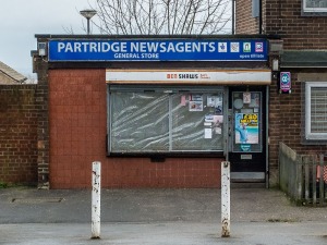
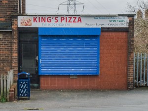
While it is difficult to show the full effect on this blog, the following are a set of four images which are expected to be viewed across four pages:

Newsagents  Pizza shop

Shops 4 page spread-1-2Shops 4 page spread-2-2

The layout is going to look a bit more like this (if you can imagine it being a four page spread):

I have also tried to create a balance between the work being read across all four pages and also for each book to work on its own rights, which has needed a careful selection of images to try to get this to work.

I also wondered whether I needed to be clear that the four pages should be read together but then decided that it would be more interesting for the viewer to make that decision, potentially pairing images in a more random order than I intended.

Going back to the study group showing, it was interesting for me to pick up where things didn’t quite work when I was trying to quickly explain things to the group, and there were also a couple of minor points I picked up from their feedback, both of which I will consider when pulling this into a final set.

The next step will be to prepare a final mock-up of the two books, probably using Blurb or some other photobook company. At this stage, I want to have books that open flat, so if Blurb don’t do that then I will need to look at the other options – for now this feature is more important than the actual print quality. I do not intend to create anything other than a ‘mock-up’ version of the final product at the end of this module, and thus intend to leave final decisions on print quality and book binding options until the final module.

And so, overall I am quite pleased with the progress I have made with this work and will now progress towards producing something for the final assignment submission. I have also just moved house (and City) yet again, which has taken me away from my studies, but I now hope to spend the next 4-6 weeks finishing things off just before my two year deadline for this module.


Leave a comment

Study Visit to ‘Here Comes Everybody’ by kennardphillipps

I went to another really interesting Scotland study visit the other weekend which was the exhibition ‘Here Comes Everybody’ by kennardphillipps (a collaborative practice of Peter Kennard and Cat Phillipps). It is being held at the Stills Centre for Photography in Edinburgh between 31 July and 25 October 2015.

I think that it is easier to repeat the introduction information issued by Stills than try to explain the work myself, and then I will go on to describe my reaction to the work:

The exhibition includes a major new installation consisting of an accumulation of photographic imagery, photomontage, digital prints, newspapers and found materials, exploring ideas around image consumption, production and surveillance.

The work in the exhibition was installation based with pallet crates used to creates structures upon which some of their work was loosely hung. There appears no precision in their work and there is quite a distressed sense to it all. I quite liked how whilst walking through the work you became engrossed within it and began to pick up on the political messages behind the work without having to direct your attention to any particular piece. In contrast though, there were also two videos installations shown in a separate room. Whilst I still got something from these, for me they were a little too direct in their political message, to the extent that I felt that they were quite advertorial in their presentation.

We were so privileged while we were looking at this work that the artist Peter Kennard came in and joined our discussions. It was great to get a sense of the artist himself and how this work wasn’t created just to make a point to others but that the work was also expressing something about himself and his own values. It was interesting to read elsewhere that neither Peter or Cat create work to make money, both of them have other jobs that help to supplement their livelihood; Peter is an educator and Cat is a printer. They both make the work because they feel impelled to do so and it is great to see how this comes out in their work through the freedom of expression and ability to play with the materials to create something – the Stills leaflet is keen to give us Peter’s year of birth as 1949, yet he has no inhibitions about playing with papier-mâché, prints and pallet crates to create an absorbing installation.

One of the key things that I took from this visit, other than the lesson to give yourself the freedom to play when creating work, is how politically motivated Peter and Cat are. They state in the Stills leaflet that they both “see the work as the visual arm of protest”. I know that my work has a political element to it yet I have been reluctant to be too expressive about this, however, this has certainly given me food for thought and some ideas on that aspect which I might think about incorporating.


Leave a comment

Scotland Study Group

I was fortunate enough the other week to have another opportunity to present and discuss my Body of Work at the Scotland Study Group day.  Its a shame that these events don’t attract a larger group as, for those who do attend, we all seem to get a great amount from it in terms of the development of our thoughts and work.  I don’t think that we should underestimate the benefit we can all get from reviewing our work with a professional photographer and tutor Wendy McMurdo.

With this review I wanted to present some of my further thoughts since the Barnsley residential.  I had decided since that critique that I needed to go through a final deconstruction process of my work to get to a stage that I might be happy to draw the line on and suggest its completion.  The main driver to this is that I have continued to have a sense that it needed something more but was unsure of what or how.  I have also picked this up as the general theme of advice from others.  In the review I presented different ideas for the title of the work, ways in which I might tighten up the collective colour and tone of images within each set as a way of making clearer which set they belong to, a tightening of the compositional alignment of some of the pairings of images so that this aspect can be seen a little more clearly, and also alternative pairings of images.  All of which is difficult to explain here without going into more detail with examples but I expect to do this in other posts as I progress with the work.

The interesting feature from what I presented is that it triggered thoughts from those I presented to which I hadn’t expected and we then went through a thorough discussion on some of the things I might think about for developing the work further.  The general conclusion I came away with is that I would need to go through quite a bit of extra work if I wanted to wanted to take this project to the next level in its development.  I was challenged about my reluctance to do this, with the question posed of “what do I have to lose?  My obvious answer to this was that I might make a mess of what I already have and in a practical sense I only have one further assignment review to go and thus little further opportunity to change and amend afterwards.

I have decided that it is worth doing this to see where this takes me and then I can review against the project as it is now.  I can then decide how to present for final assessment.  The implications of this is that my next and final assignment for Body of Work is likely to be delayed somewhat, particularly if it means going back to Thornhill to take more photographs


1 Comment

Barnsley Residential & Work Critique

Its been a week since the Barnsley Residential predominantly for Level 3 photography students which was a great success and really well organised by John and Penny.  The big event I think for most students was the opportunity to have their work critiqued, probably for the first time.  For some it was an early showing of some ideas that they are developing whereas for others such as myself it was a last opportunity to get an audience reaction to a nearly complete body of work.

I was fortunate (I think) to be the first to have their work critiqued by the group, and more favourably for me also by photographer John Davies who stayed behind after his presentation to join in with the critique session.  There were many offers of advice fed back as I was presenting the work which was a challenge to absorb it all at the same time as trying my best to explain its different aspects.  Jesse suggested at the end of the weekend that students should think about recording such sessions which, with hindsight, is something that I should have done as I did come away a little confused with some conflicting offerings given.  On the following Monday, Sharon posted a really helpful note to a link on how to resolve the advice offered from such critique sessions, which was generally to be confident enough in your own work to decide which advice could be helpful in progressing your work and which you might decide to ignore as a difference of opinion or doesn’t fit with the concept of your work which you may have only had 10 minutes to explain, in this instance, 18 months of developing the work.

I did write down some notes soon after the session so that I could capture the advice that particularly struck a note with me and give it some further thought.  This is what I want to muse about here:

There was a discussion emanating from the group about the different layers with which this work could be read.  The title of the work is ‘Land Values’, my presentation of the work was about the idea of a childhood paradise under threat, and the pairing of the images in the book suggested, as John Davies picked up, a sense of the autobiographical.  I confirmed that this was both a challenge and a feature of this work as I am pleased that it can be read in different ways whilst not wanting it to be too confused for the viewer.  Jesse suggested that I think about introducing the word ‘Paradise’ into the title.  I had just shifted the title back to ‘Land Values’ as it relates to my overall concept but I see where this comment is coming from and intend to give it more thought.  I also think that if I change the title then I will need to revisit the final artist’s statement which I include at the end of the book.

The key advice I seemed to be getting from John Davies, and some others, is that I need to strengthen the aesthetic connection between the images.  He picked up that some of the childhood locations where of more ‘messy’ places and that I should perhaps make more of that to bind the set together, with the Glasgow images then being a little brighter and optimistic set.  He also suggested, I believe, that some of the pairings didn’t work as well as others, particularly in the second half of the series.  This is also something that other students were suggesting, even though everyone seemed to have different sets that they liked and didn’t like and thus is something that I can never fully resolve.  I explained that the second half of the series is where I have been struggling with the most and thus is something that I now intend to go back to.  From this I have decided to give the whole series a final, more critical edit both aesthetically as well as the pairings of images.

A specific question that I asked the group was their thoughts about my use of words as labels under each image.  I explained how after my last assignment it was suggested that I was too limiting in the use of words to entice the viewer towards my concept and to explain how the images work as pairs rather than individual images.  The inclusion of labels was thus an experiment but something I always have reservations about as it can very easily spoil the work.  The clear advice back, particularly from Jesse, was that these labels about what paradise was don’t add anything to the interpretation of the work and thus should probably be removed.  I was pleased to gain this clear feedback.

On the other hand, I do  recall a point made that it was unclear what I was trying to say with some pairs of images but I explained that this was the intention to be vague rather than illustrative and that it is through a sense of the whole series that there images can be interpreted.  I therefore don’t intend to dwell too much on this.

One further comment made was by Jesse who wondered whether I might consider creating two sets of books rather than directly pairing them in an individual book.  I am not sure if I fully understood his point on this but it did trigger some further ideas on my part.  The pairing of the images is important to how this body of work comes together, even though it isn’t critical that this is how they are read.  I am having a thought of something that would effectively be two books but joined together so that the images can still be reviewed together.  Difficult to explain here but it has certainly given my something to think about.

Overall, a really good, effective and very useful session which gave me answers to some things and ideas for others – including how to go about what will probably be my final edit on this work before I progress to the next stage.

Thanks all for your constructive feedback


Leave a comment

Words, Words, Words

I have been giving a lot of thought recently to the impact of words on a body of photographic work, such as the one I am developing at the moment.

When I went to see Chloe Dewe Mathews’ Shot at Dawn exhibition at The Stills, the impact of words was quite significant to the interpretation of the work.  The large scale photographs of relatively ordinary fields, a school, trees, a church, etc., were accompanied with a list of names.  Connecting that to the title of the work ‘Shot at Dawn’ and you begin to make a connection.  With your interest pinged and a little more research, the understanding of the works becomes clear that these locations are places were soldiers were shot for desertion.  Then suddenly your appreciation for the works rises to another level.

Also, at the exhibition ‘Conflict Time Photography’ held at the Tate Modern in London, there was so much work on show that it was only by reading the accompanying words that one gained a better appreciation of the work.  This was probably also of particular importance for this type of work as most of it was focused on remembrance of a time passed which had erased most of the evidence of the conflict that had previously occurred.

With my body of work, I have quickly concluded that I will not be adding labels to any of the photographs.  I rarely find that this works and is a bit too directional.  The ambiguity of my series is what I think makes it work; which can even confuse me at times as I see different layers of understanding within it, and which is something I want to retain within.  This leaves me with two further opportunities to support my work with words; these are the title of the body of work and an accompanying written piece – such as the artist’s statement.

As the work incorporates pairs of images from which the audience is able to compare and contrast, I wanted a title that encompassed how these pairs of images related to each other.  When I first started this body of work I wrapped a lot of my investigations around a working title of ‘Land Values’, and while I think that there is still an intrinsic element of this within the work, I now believe that it has shifted away from this direction.  I do also believe that I have a much better understanding now of what I am trying to say with this work, which has definitely benefited from the research I have been doing particularly around my Contextual Studies report.

In light of this, the Council estate aspect is about looking back at what as a society we might have lost from the past and questioning whether we might long for its return.  For the Glasgow estate it is about reflecting on the future and the opportunities that might be possible as I begin to engage with this place.  This is why I am relatively happy with the title ‘Lost Opportunities’, however, the further interesting aspect of this is the way that by joining these words together it creates a further meaning – Lost Opportunities could also suggest regret, which is possibly something I am asking within the work but not necessarily intending as a direct statement.

With this title relatively firm in my mind the next question for me is the introduction of a short written piece.  As there is an academic purpose to this work I think it suitable to incorporate this as an artist’s statement.  I have had several goes at this over the last few months and there are several blogs associated with my different attempts.  I was generally happy with the last attempt, however, having followed a useful discussion on this topic on the OCA website I decided that I needed to give it another refresh.  I was little concerned that I had shifted it too far towards a general audience’s understanding of it and that it needed a little more academic vigour.  The revised version is included below, which will form part of my Assignment 4 submission of the body of work.  Before I include it though I also want to mention that I am still wondering where to place it within my Body of Work.  On the fairly firm assumption that I will be producing a book, I am undecided whether I should put the text at the front or at the back of the book.  I am liking the idea of allowing my audience to view the images first and getting them to think about it before reading about my intentions.

So here is my revised artist’s statement:

Lost Opportunities investigates how changes of time, place, and society can change a person’s relationship with, and appreciation for, both land and the place it forms.  It does so by looking back at a Council estate in West Yorkshire where I grew up, and then compares this with the present area I have just moved to in Glasgow.

Images of the Council estate recall ordinary places that have a significance to me, whilst also depicting what I now reimagine as a childhood paradise where I was seemingly free to engage with the land and place oblivious of the threat to this utopia from adulthood and societal influences.  The imaginary idealisation of this time identifies with Neo-Romantic principles which regards the past as an integral part of our heritage and national identity and thus something we must preserve, or maybe long for its return.

In Glasgow I wandered around this new place to seek out the heritage I have now adopted, to reflect on its potential of becoming significant to me in the future, and to question whether the idealised notion of a childhood paradise could still be created in this place today.  This shift in time, place and society forms a narrative about change, to ask whether it is a threat to the way things were, or the beginning of new opportunities.


Leave a comment

Viewing Different Exhibitions

I’ve been to several exhibitions recently and rather than write a précis of the artists’ work I thought that I would write something about my impressions of each exhibition and how I felt each one worked differently.

The first one was the Chloe Dewe Mathews’ Shot at Dawn exhibition held at the Stills Gallery in Edinburgh.  I have already provided a write up of what I thought about the excellent work work so, as I say, this bit is about the exhibition showing itself.  I am not sure about the funding situation for the Stills Gallery but this exhibition was quite a high profile for this gallery and yet was free to view.  The space available gave ample opportunity to show enough of Matthews’ work to gain a good sense of what the work was about and the message it was trying to express.  These photographs were printed large therefore there needed to be sufficient white wall space to achieve this and so the venue seemed to work quite well for the photographer.  The overall impression was that the exhibition had made every effort to show the work to its best and for that to be its absolute focus, rather than it be about the exhibition itself.

Next I took a quick visit to a student showcase event in Glasgow which had selected what they felt was the best work from student shows across Scotland this year.  The space available was plentiful with good natural light however because this was a showcase there was only limited space for each student.  As a viewer I got the sense that I needed to see more of each student’s work to get a sense of their intentions.  The limited allocation of space did affect this quite a bit.  It was still interesting to go see the exhibition as a useful benchmark for my own work.

The following week I went to an OCA study visit to the exhibition ‘Conflict Time Photography’ held at the Tate Modern in London.  This exhibition was based on a central connecting theme rather than any individual artist.  The space given over to this was huge which allowed many different photographers work to be shown and thus enable comparison between how each of them connected with the theme.  The problem with this was that the exhibition as a whole became the focus of attention rather than getting to know any particular artist’s work.  My reaction to this at the time was jotted down in my notebook:

“In a sublime sense the images do little for me.  My only experience of war is from movies and computer games therefore these photos relate more to those media experiences for me.  It is the accompanying words that seem to have the power and the images a mere catalogue and evidence to support those words.  The exception is McCullen’s classic portrait of a soldier just after battle.  The immediacy of this image gives it its power.  I question with the rest, how long afterwards do these events become nostalgic.”

There was a general discussion about whether this exhibition worked in its layout and approach.  The curator had organised it based on how long after the actual event/war that each work had been photographed, with the first photographs taken the closest after the actual event.  There was a suggestion that it might have worked the other way around so that there was a growing sense of audience impact as you walked through the exhibition.  I could, however, see what the curator was trying to achieve as the widening time between the event and the photograph was similar to the growing time between entering the exhibition and then leaving.  The other feature I picked up from the exhibition was how my sense of appreciation of the style of each work changed from documentary for those shot closest to the event, moving on to remembrance, and then to nostalgia as the photographs were shot furthest from the actual event.

Overall, this exhibition was big and bold and thus seemed to focus attention more on the exhibition itself rather than showcasing any individual photographer.

The latest exhibition was ‘Ponte City’ held at the National Portrait Gallery in Edinburgh.  This is a typically historic and impressive building located in the city centre yet there was still a good balance between the photographic work and the exhibition space which gave the viewer the time and space to interact with the various different aspects of the show and gain something from this.  The work itself was an eclectic arrangement of photographs and found documents that were used to document the experience of living in this semi-derelict apartment block in Johannesburg.  I think that the curation was thoughtfully planned with the viewer experience in mind.


Leave a comment

Chloe Dewe Mathews’ Shot at Dawn exhibition

This is my review of the Chloe Dewe Mathews’ Shot at Dawn exhibition held at the Stills Gallery in Edinburgh. It was part of an OCA study visit and so other students have already posted some very good reviews of this visit, namely Duncan Astbury, Yiannitsa Stevens and Mark Jones, which I am mindful of when writing my review. I have tried to focus this on my thoughts and response to the exhibition rather than an overview of Mathews work as I want to reflect on how this might link to my work.

I did a little research on this exhibition before I arrived so did have some understanding of the context and we did discuss it as a group before having time to review the exhibition. Her photographs are of seemingly ordinary places with no discerning connection between them until you note the text by the side of each image. The interplay between image and text is very important here as it creates significance to each place as locations where soldiers of World War I were shot for desertion.

In my mind, the work is commemorative towards the personal sacrifices and tragedies associated with this part of our history. It is a work that was commissioned 2 years ago, I presume not by accident, to coincide with this commemoratory year for Word War I. This allowed Mathews two years of research and investigation in preparation for this body of work. The strategy that she took is also an important feature of understanding this work and was discussed at length by the student group I was with.

The photographs on show were printed large, which I know is a modern feature but also one that helps these relatively banal subjects come alive. I wonder whether if printed smaller they would have had the same affect. This may be something that I will need to think about in the future as I am also photographing quite ordinary places for my body of work, which at the moment is focussed around producing a book, but what do I do if I want to exhibit them?

My overall response to this work was positive as I felt that the connection between photographs, text, and an understanding of the research behind it all interplayed in their presentation to the audience. Also, as time went by I began to notice objects within each photograph that could be interpreted as symbols associated with the theme of the work – a single tree representing a last man standing, trees on the floor of a woodland representing fallen men, an embankment as the wall for a firing squad. I wonder whether this was just me projecting thoughts into the images, or a specific strategy of the artist.

Overall, I think that this commemorative work was asking us to remember the human sacrifices, and sometimes abhorrent way that fellow humans can treat each other, as a lesson for the future – if we cannot learn from our mistakes then what hope do we have of not doing this again in the future? The land itself seems to have forgotten these events so as photographers and artists we need to use our skills to find ways of capturing our imaginations and making us think about such events, which I think that Matthews has been very successful in this endeavour.


Leave a comment

Literature Review

Land Values and Phtography

This blog is an overview of my Literature Review for Contextual Studies, but only within the context of its relevance to my Body of Work:

The following therefore describes some of my thoughts, concerns and challenges I have gone through in developing a literature review around the general subject of Land Values and Photography:

  • It was difficult to pitch the literature review in the right context as, at this stage, I was still unclear on the final direction for my Body of Work.
  • However, I wasn’t intentionally trying to contextualize my body of work at this stage.
  • The literature review delved into the philosophical distinctions to the term value and society’s potential need to take action.  This included a short literature survey of the different strategies undertaken by photographers to express their view on society’s relationship with and value for Land. 
  • My concern was that I was concentrating too much on the philosophy of ‘value’ and less so on visual culture. This was also probably coming through on my project development at the same time.
  • I thus concluded, mainly following my feedback on the literature review that I needed to a particular aspect of visual culture as it related to land values – this helped me to refocus my body of work too.


Leave a comment

Catalogue of Arles Study Visit

I know that I said I wouldn’t be writing up any more specific details of the Arles Study Visit unless I was referring to something as part of my thoughts on other posts, however, as I felt the need to catalogue my visit as an aide memoire for my studies I thought that I would share it here on my blog.  This will provide a good place to recall it but I also thought that it might help other student visitors to my blog in their wider research as well as to get a better sense of the intensity of diversity of such a study visit.  And with that, here it is along with a short note of my immediate thoughts on each photographer’s work:

FRIDAY MORNING

The Walthur Collection

Themes:

  • Taxonomy – the system of classification
  • Typology – the act of placing something into a collection – a systematic classification
  • Seriality – pursuing of a theme over a period of time

Karl Blossfeldt – collection of plant images identifying their design and shape – an example of how early photography was used to reveal things not otherwise noticed.

Bernard & Hilla Becha – photographic survey of industrial things that were soon to be lost – impressive visual presentation where the identical composition and tonal range of each image binds the work together.

J.D.Ojeikere – backs of heads of African women each with uniquely platted hair – the images are less identically structured than Bechas’ but worth noting that the body of work was built up over 10 years.

August Sander – portrait collection of 1920’s German people – portraiture not really my thing but still a very impressive pre-war collection, worthy of greater study for anyone into portraiture.

Richard Avedon – collection of middle upper class people with a greater sense of personality & power than Sander’s – a good comparator with Sander’s work.

Accra Shepp – full length portraits of people at Occupying Wall Street – dates at bottom help to remind that it was not a one off day – this didn’t appeal as much as the above, mainly because it seemed to create a sense of ‘look at me and where I am’, rather than portraying a political understanding of the event.

Nobayoski Araki – 101 Works for Robert Frank – diarised sequence of erotica and the every day banal – a snap shot approach which works when you are able to browse passed each of the 101 images rather than stop to think about them individually.

W.M. Hunt Collection – more to do with the collection itself, which was about archival group photographs – didn’t get much from this.

FRIDAY AFTERNOON

Mazaccio & Drowilal – winners of BMW’s artist in residence prize, creating a collection based around our fascination for and relationship with animals – prints on everyday items.  Upstairs exhibition was a series of collages, mainly of large printed sheets of kitchen roll with photograph cut outs superimposed onto the design of the kitchen roll – difficult to explain the ‘left-field’ aspect of this exhibition but it was great to see what could be done, even if it was some way from my own photographic horizons.

David Favrod – Hikari (the light) – body of work based around a conversation the photographer had with his grandparents one day about the Hiroshima bombings – everyone was impressed with this and it remaindered me of my own thoughts of blackening out parts of an image to highlight my political concerns, may need to look back on this.

Vik Muniz – uses family photos and postcards to create his own large scale montages, some of which created a 3D effect as eyes followed you as you moved around the room – interesting, but I find myself looking more at the technique rather than any message they portray.

SATURDAY MORNING

Collection of Dutch photographers

Eric Kessels – a collection looking from above at the tops of cars and what they reflect of the surroundings from the body work – its interest didn’t hold me for long.

Hans Eijkelboom – questioning identity in four different ways: (1) turning up at strangers’ homes when the husband was away and interjecting himself into the typical family portrait; (2) following a photojournalist and placing himself into the scene that was to be photography and used in the local newspaper; (3) buying a new set of clothes each week and then taking a self-portrait wearing these clothes; and (4) asking people from school that he hasn’t met for a least 10 years what they thought he might have become and then photographing himself as that character – good approach towards getting the audience to think about different aspects of the same concept i.e. identity; we did wonder whether the photographer was telling the whole truth about his approach to some of these those (and whether this was positively purposeful).

Hans De Vries – The History of the Lemon Geranium:  Says it all really – he follows the development of a geranium plant, as well as those he shared with friends!!! – my passion for geranium’s hasn’t shifted.

Jos Houweling – a photo based typology of Amsterdam (taken in the 1970’s), depicting aspects of the city often ignored.  He arranged these into different categories such as bicycles, prams, cars with covers over them, people looking out of windows, utilities grates found in the floor, and dog poo found on the pavement (of particular interest of Gareth).  Creates a good sense of place – it reminded me a lot of my Glasgow project.

Maurice Van Es – abstracts of every day items found in the home that have a significance to the photographer’s memory, and, a series of the photographer trying to photograph his younger brother who wants to hide behind the corner of the house – not particularly inspired by this.

Milou Abel – young photographer documenting the relationship she has with a young ‘special’ woman who has a penchant for collecting clothes – not particularly memorable for me.

Hans Van Der Meer – a collection of images or medium sized Dutch towns, showing their similarity of design whilst also encompassing a catalogue of hard landscape items found within these environments – I found it interesting whilst others didn’t seem to.

A Retrospective of the environmental award; Prix Pictet “New works from the four winners of the prestigious Prix Pictet devoted to sustainable development”

Mitch Epstein – a study of urban trees and their relationship with urban life and people – this is an aspect I have been thinking about as I wandered around Glasgow’s West End (an example of place affecting land, and land affecting place ).

Nadav Kander – photographs of desolated landscapes of restricted military zones – beautifully photographed and presented large scale, creating a sense of the sublime.

Chema Madoz – juxtaposing everyday items of the banal in a unique, often surreal, way to create new perspectives and meanings – visually quite brilliant but I couldn’t take any more than that from it.

SATURDAY AFTERNOON

The Discovery Award – “The Discovery Award honours a photographer or an artist working with photography whose work has just been discovered or deserves to be.  The ten nominees exhibited have been selected by five great figures in photography from the five continents”:

Ilit Azoulay – large scale ensemble of objects found on construction sites and then arranging them to compose a new photograph of them – didn’t feel overly inspired with this.

Katharina Gaenssler – a room size collage created from smaller photographers of the same grand scale collage – again not too inspired here either, collages don’t seem to be my thing.

Miguel Mitlag – “has chosen to construct the spaces he photographs, producing images of singular intensity, an improbable and shifting substance, which he describes as ‘pseudo-realist’.”  Make of that what you will, as I couldn’t!

Victor Robledo – a study of light in space and shadow, he looks at the emotional quality of light and how it affects the perception of time.  A very quiet, unassuming series of photographs of white walls, shadows they create, and reflections through mirrors set at angles against these walls – a slow burner this one I think.

Youngsoo Han – photographer from South Korea who died over a decade ago therefore difficult to see how he fitted into this show.  His photos are based around street photography in his country and are very reminiscent of Henri Cartier Bresson – good images but outdated in this contemporary field.

Kechun Zhang – visually appealing large scale images taken along the Yellow River in China.  The subdued colour palette and misty atmosphere help to create a serene environment for each photograph – are they beautiful or sublime or both?

Pieter Ten Hoopen – a 10 year documentary of a small town in America close to the Glacier National Park.  It is presented in a dark, foreboding, and depressing palette; which helps to portray a true sense of the place and the struggle for a livelihood of its habitants – this was one of my favourites, mainly because I have seen this type many times before yet this was somehow more genuine & believable than others.

Will Steacy – an investigation into the changing face of a local newspaper business affected by the introduction of technology which began to replace the need for people to the extent that the business was eventually not required.  It asks the viewer to think about the cost of this loss, not only of people’s livelihood but also of a tradition based around people – how will news be reported if there are no people to report it? – there was a debate about its presentation which had a lot of material whereas it could be argued that  the key message was already told in a selection of four images – I liked this mainly because it made me properly think about the social implications of the loss of this industry

Kudzanai Chiurai – a fictional tableau of the notion of sacrifice in modern political conflict, as well as the impact of corruption and government policy – this nearly grabbed me but not quite.

Patrick Willocq – performative images of indigenous African culture, done in a seemingly comical manner – very colourful and eye-catching but I struggled to find its serious point.

Leave a comment

Overview of study visit to Arles

Having just finished the OCA Arles Study Visit I can positively report that it was a thoroughly enjoyable and stimulating few days.

I was pleasantly surprised by how much of the work I saw that I could relate to my own Body of Work and thus the potential for progressing it further.  With just this thought in mind I would highly recommend this, or similarly intensive exhibitions, to any and every student wishing to progress their work.  A benefit of this is to be able to compare your work against the diversity and complexity of a huge range of contemporary photographers to understand where your works fits, or how far you need to progress, compared with these standards of work.  Even with work I wasn’t impressed with, or just did not get, I was able to reflect on why and then think about whether this negative critique could be relevant to my own work – what would I need to do to ensure that my work would surpass such negative or disinterested critique?

I have decided to leave this overview of my Arles study visit fairly short as I am not intending to write up a catalogue of each exhibition I visited.  This would take an age to do and would be of little further benefit to me.  Instead, I intend to revisit my Body of Work and develop some aspects of it within the context of what the Arles study visit has inspired me to do.  As I say, there is a lot that I can relate to from the exhibition which will hopefully be seen in my next few posts.